

Quick answer. The best law font depends on the job. For court filings, follow the rule: the U.S. Supreme Court requires a Century-family typeface at 12 points for booklet briefs, federal appeals courts require proportional fonts with serifs at 14 points or more unless a local rule allows less, and Florida requires Arial or Bookman Old Style at 14 points. For contracts and letters, use a book serif such as Century Schoolbook. For websites, use a sans serif such as Open Sans, Inter or Lato at 16px or larger.
Key takeaways
- Court rules come first: the Supreme Court's Rule 33.1(b), FRAP 32 and state appellate rules set fonts and sizes for most appellate filings.
- Matthew Butterick says he has never found a court that requires 12-point Times New Roman, and the Seventh Circuit advises against it.
- Without a rule, a book serif with a generous x-height, such as Century Schoolbook or Bookman Old Style, is the safer document choice.
- Lawyer websites that use Google Fonts lean on Open Sans and Roboto; pick one family, self-host it and set body text at 16px or more.
- WCAG 2.2 sets contrast ratios (4.5:1 for normal text) and a 200% resize rule, but it sets no minimum font size at all.
- Every use needs a license: desktop, webfont, app and PDF embedding are separate rights, so check before a font goes into templates.
Law fonts are the typefaces lawyers and law firms use for court filings, legal documents and firm branding, from briefs and contracts to websites, ads and letterhead. The right lawyer font is decided first by any court rule that applies, then by who reads the text and the medium it appears in.
I'm Tarun, founder of Mass Tort Marketing Agency. We build the websites, landing pages and intake flows that plaintiff firms use to reach clients, which is where a firm's type choices meet the public.
Use the guide in order or jump around. The quick-reference table below gives a first choice for each job. The four-gate test that follows is a decision tool for any font you are considering. The court rules section quotes the actual federal and state rules with links and dates. Then come profiles of 24 fonts, followed by websites, accessibility, ads, intake forms and licensing. Prices and rules are stated as of October 2026, and sources are linked where they are used. Nothing here is legal advice; rules change, so check the current version before you file.
Best law fonts by use case: quick reference
Match the font to the job, and where a court rule exists, let the rule decide. The table below gives a first choice, good alternatives and a size for the ten jobs law firms ask about most, with the source that governs each one.
| Use | First choice | Good alternatives | Size | Governing source |
|---|---|---|---|---|
| U.S. Supreme Court booklet brief | Century Schoolbook | New Century Schoolbook, Century Expanded | 12-pt text, 10-pt footnotes | Sup. Ct. R. 33.1(b) |
| Federal court of appeals brief | Century Schoolbook | Book Antiqua, Bookman Old Style, Palatino | 14-pt (Seventh Circuit allows 12) | FRAP 32(a)(5); 7th Cir. R. 32(b) |
| Florida appellate filing | Bookman Old Style | Arial | 14-pt | Fla. R. App. P. 9.045(b) |
| California appellate brief | Century Schoolbook | Any conventional font (rule 8.204) | 13-pt minimum | Cal. R. Ct. 8.204, 8.74 |
| Trial-court papers | The local rule; a book serif | Georgia, Cambria | 12-pt or the local minimum | Local rules |
| Contracts, letters, memos | Century Schoolbook or Equity | Book Antiqua, Cambria, Constantia | 10-12 pt | Firm style guide |
| Website body text | Open Sans, Inter or Lato | Roboto, Merriweather, system stack | 16px or more | USWDS guidance |
| Website headings and logo wordmark | Montserrat, Libre Baskerville or a licensed display face | EB Garamond, Century Gothic, The Attorney typeface | Scale from body | Trademark search; license |
| Email and signatures | A system font stack | Arial, Georgia, Verdana | Match body text | Email clients vary |
| Ads, captions, TV supers | A sturdy sans | Inter, Open Sans, Roboto | Readable on a phone or across a room | FTC "clear and conspicuous" for disclosures |
Read each row left to right. "First choice" is the face I would start with for that job; "Good alternatives" are faces that also fit the rule or the medium, so a firm can stay with fonts it already licenses. "Size" means body text unless the cell says otherwise. Headings, footnotes and captions follow their own rules, and the court rules section spells them out.
The court rows summarize rules that have their own wrinkles. The Supreme Court's Century requirement in Rule 33.1(b) applies to booklet-format documents only; Rule 33.2, which covers filings on 8½ × 11-inch paper, names no typeface at all. FRAP 32 sets 14 points for federal appeals, but the Seventh Circuit's own Rule 32(b) permits 12-point text and 11-point footnotes. California's rule 8.204 accepts "any conventional font," while rule 8.74 for electronically filed reviewing-court documents says Century Schoolbook is preferred.
Three notes on using the table:
- Where a rule names fonts or sizes, the rule beats this table. A local rule, a chambers procedure or a judge's standing order can add requirements the statewide or federal rule does not mention.
- The "first choice" column is my recommendation, not a requirement. Two firms can reasonably pick different faces from the same row and both be right.
- Every row has a full treatment later. Court rows are covered in "What font do courts require? Federal and state rules"; contracts and letters in "Best fonts for contracts, letters and legal notices"; individual faces in the two numbered font lists; websites in "Website typography: size, spacing, loading and speed"; and ads, captions and disclaimers in "Fonts for ads, landing pages and intake forms".
How to choose a law font: the four-gate test
Run every font decision through four gates in order: Rule, Reader, Rights and Render. A font that fails any gate is out, however good it looks, and a font that passes all four is a sound choice even if it is not the most fashionable one.
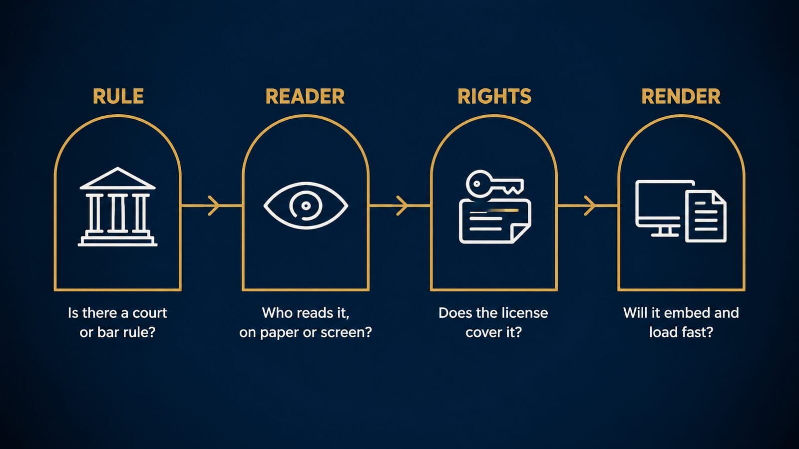
Gate 1: Rule
Ask whether a court rule, local rule, judge's standing order, government specification or bar advertising rule controls this document. If one does, it decides the font or narrows the field. The Supreme Court's Rule 33.1(b) limits booklet filings to the Century family. Florida's Rule 9.045(b) allows two faces. One magistrate judge in the Northern District of Illinois sets word limits in written briefing procedures to steer lawyers away from Times New Roman. For ads, the typeface itself is rarely regulated, but disclaimers must be readable and the ad must not mislead; see the state bar advertising rules for detail.
Gate 2: Reader
Ask who reads the text, for how long and on what. A Seventh Circuit judge reads about 1,000 pages per argument session, according to the court's practitioner's handbook. An insurance adjuster skims a demand package. A client signs an engagement letter on a phone. A TV viewer sees an on-screen super for a few seconds. Long reading favors book serifs with a larger x-height, which the Seventh Circuit recommends. Small screens favor sturdy faces at an effective 16px or more, the U.S. Web Design System minimum.
Gate 3: Rights
Ask whether the font is licensed for this use and for this many people. Desktop installation, webfont use, app embedding and PDF embedding are separate rights, and a license that covers one may not cover another. MB Type's license, for example, sets out separate terms for PDFs, websites and shared word-processing files. Fonts in the Google Fonts repository are licensed with permission to redistribute, so a firm can host them on its own server, subject to each license's terms. The licensing section near the end of this guide covers the details.
Gate 4: Render
Ask whether the font will survive every place it appears. Will it embed in the PDF you file or send? Word lets a font maker set embedding permissions of Non-embeddable, Preview/Print, Editable or Installable. Will it hold its layout on co-counsel's machine? Metric-compatible fallbacks such as Tinos for Times New Roman help. Will it load fast enough on the web to protect Core Web Vitals? And will it stay legible at the smallest size it will ever appear, such as a footnote or a disclaimer line?
The four-gate scorecard
Use this table as a checklist when a partner, designer or vendor proposes a font.
| Gate | Question | Pass if | Red flags | Covered in |
|---|---|---|---|---|
| Rule | Does a court, judge or bar rule control this? | The font and size meet every applicable rule | Font not on a rule's list; size below minimum | What font do courts require? Federal and state rules |
| Reader | Who reads it, how long, on what? | Comfortable at the real reading size and device | Small x-height for long reading; thin strokes on phones | Typography basics every lawyer should know |
| Rights | Is it licensed for this use and headcount? | License covers desktop, web, app and embedding as needed | Downloaded from a mirror site; webfont use not covered | Where to get law fonts legally: free, paid and custom |
| Render | Will it embed, travel and load fast? | Embeds in PDFs, has fallbacks, loads without layout shift | Non-embeddable; no fallback; heavy font files | Website typography: size, spacing, loading and speed |
Score each gate pass or fail. There is no weighting: a single fail removes the font for that use, though the same font may pass for a different use.
Two worked examples
Example A: a Florida initial brief.
- Rule: Florida's appellate rules require Arial 14-point or Bookman Old Style 14-point for computer-generated filings, as The Florida Bar News reported when the change took effect. According to Syfert Law's mirror of the rules, the certificate of compliance must state both the font and the word count, and footnotes must be the same size as body text. The same mirror shows a 13,000-word limit for initial briefs.
- Reader: judges reading on monitors. Feedback gathered by a Florida Bar rules committee favored these two faces for on-screen readability.
- Rights: Bookman Old Style ships with Microsoft Office and Arial with Windows, so no purchase is needed.
- Render: embed fonts when saving so the PDF looks the same everywhere.
Result: Bookman Old Style at 14 points throughout, footnotes included. I would pick it over Arial because it is a serif book face, the kind the Seventh Circuit recommends for long reading.
Example B: a mass tort landing page for a product-liability campaign.
- Rule: no typeface rule applies, but ABA Model Rule 7.1 and the state versions of it bar false or misleading communications, and any required disclaimer must be readable. State rules vary.
- Reader: prospective claimants on phones, many of them older. The CDC estimates that about 7 million people in the U.S. have vision impairment.
- Rights: an Open Font License family such as Open Sans, hosted on the firm's own server.
- Render: body text at 16px or more, text contrast of at least 4.5:1 under WCAG 2.2, self-hosting through the site's framework, and a deliberate
font-displaychoice so the text does not jump as the font loads.
Result: Open Sans or Inter, self-hosted, with 16-18px body text. The gates do not promise more leads; they make sure every visitor can read the page and the disclaimer.
Why font choice matters for a law firm
Type affects how easily judges, adjusters and clients read and remember what a firm writes. It also decides whether the firm looks like the same firm on its website, its letterhead, its ads and its documents.
Readability for judges, clerks and adjusters
Judges are the heaviest readers most lawyers will ever write for. The Seventh Circuit's handbook says its judges hear six cases on most argument days and nine on others, and read about 1,000 pages per argument session. That is the court's stated reason for caring about typography at all. Its guide contrasts a newspaper reader looking for a quick read with a lawyer who wants to "maximize retention," and it treats the typeface as one of the tools for getting there.
The federal rules make a similar argument. The 1998 Advisory Committee Note to FRAP 32 says studies have shown that long passages of serif type are easier to read and comprehend than long passages of sans serif. The note cites no specific study, a point worth knowing before you repeat it, but the rule built on it still requires serif body text in federal appellate briefs.
The same logic reaches past the courthouse. A personal injury demand package or a run of settlement correspondence is a long read for an insurance adjuster, who also works through stacks of documents every day. In my view, anything a firm wants read closely deserves the same care it would give a brief: a comfortable face, a sensible size and clean headings. That is an opinion, not a finding; no study measures adjusters and typefaces.
First impressions: what the research shows
Much of the marketing advice on fonts leans on one statistic: that people judge a website in 17 milliseconds. The study behind that number, by Tuch and colleagues (2012), had participants rate 119 screenshots of whole websites. It found that visual complexity and prototypicality, meaning how much a site looks like a typical site of its kind, shaped aesthetic judgments within 50 milliseconds, and complexity did so even at 17. It did not test fonts.
The research that does test letterforms is more modest than the marketing claims. Arditi and Cho (2005) found that fonts with small serifs were slightly more legible than sans serif on one measure, found no effect of serifs on reading speed, and found no legibility difference between faces that differ only in having serifs.
I found no legal-industry data showing that a particular font builds trust, wins cases or converts more website visitors into clients. Choose fonts for legibility and consistency, and treat any claim that a typeface persuades with skepticism.
Brand recognition and consistency
Recognition comes from repetition. A firm that uses the same one or two families on its website, ads, letterhead, signage, business cards and document templates looks like one organization wherever a client meets it.
The practical threat to consistency is software defaults. Word's default font has changed more than once, so documents created by staff on different machines and different Office versions drift apart unless the firm sets its own template. The section on Word defaults, PDFs and e-filing walks through that history and the fix. Logo and wordmark typography is covered with the firm's type system later in the guide.
Where type meets a plaintiff firm's clients
For a personal injury or mass tort firm, the client's path runs through a series of type decisions, and each one is a chance to be read or ignored:
- A TV, connected-TV or social video ad: the on-screen super and the disclaimer have to be readable in the seconds they appear.
- A landing page: the headline, body copy and phone number have to work on a small screen.
- An intake form: labels, input text and error messages have to be clear enough that a stressed person finishes the form.
- A text or email follow-up: the font is often whatever the recipient's app shows, so plain structure matters more than the face.
- An engagement letter e-signed on a phone: size and spacing have to survive a small screen.
- Case updates and a settlement statement: a long, consequential read where a clear book face and real headings help.
Each step is part of personal injury lawyer marketing and of 24/7 legal intake, and each has its own type specification. The section on fonts for ads, landing pages and intake forms gives those specifications channel by channel.
Typography basics every lawyer should know
A handful of terms, including x-height, serif, point, leading and measure, explain almost every court rule and design recommendation in this guide. Learn them once and the rules start to make sense instead of reading like arbitrary preferences.
Typeface vs font, legibility vs readability
A typeface is a design, such as Garamond. A font, strictly, is one specific version of that design: Garamond Bold at 12 points, or the single file that contains Garamond Italic. A family is the full set of weights and styles that belong together, such as regular, italic, bold and bold italic. In everyday use, and in Word's font menu, "font" means the family, and this guide uses it that way except where the distinction matters.
Legibility and readability are also different things. Legibility is how easily a reader can tell individual letters apart: whether a capital I, a lowercase l and the numeral 1 look distinct, or whether rn could be mistaken for m. It is mostly a property of the design. Readability is how comfortably a block of text reads over many lines and pages. It depends on the typeface, but also on size, line spacing, line length and contrast with the background.
The distinction matters because a highly legible font can still be set unreadably. A clear face at 9 points with tight line spacing and lines running the full width of a landscape page is hard work for anyone. Most court rules regulate both: the typeface or style for legibility, and size, spacing and margins for readability.
Letter anatomy: x-height, cap height and counters
A handful of parts explain why some faces read better than others at the same size.
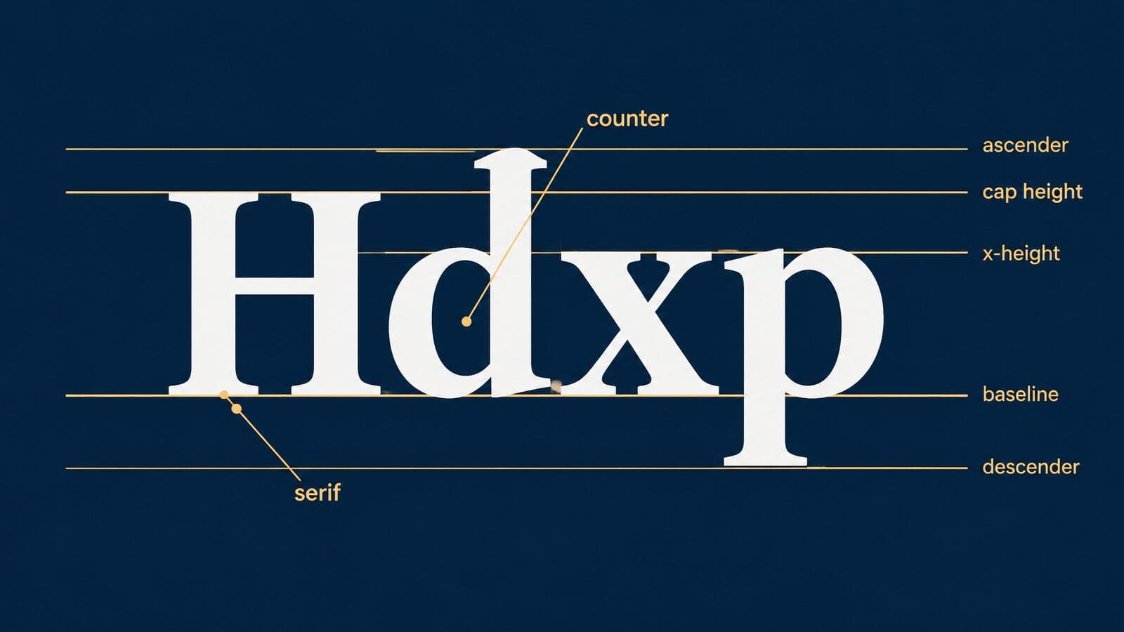
- Baseline: the line the letters sit on.
- X-height: the height of lowercase letters without ascenders, such as x, a and e.
- Cap height: the height of capital letters.
- Ascender and descender: the parts of letters such as d and h that rise above the x-height, and of letters such as p and g that drop below the baseline.
- Serif: the small finishing stroke at the end of a main stroke.
- Counter: the enclosed or partly enclosed space inside letters such as o, e and a.
- Stroke contrast: the difference between the thick and thin parts of letters.
Because most of the letters in running text are lowercase, the x-height largely sets how big a face looks. The Seventh Circuit's typography guide reasons from exactly this: faces with a larger x-height are more legible, so it says faces in the Bookman and Century families are preferable to faces in the Garamond and Times families. The guide also says capital letters of 12-point type are a sixth of an inch tall. Treat that as the court's simplification; point size technically measures the type body, not the height of any letter.
Serif vs sans serif: what the evidence says
Serifs are the small strokes at the ends of letters in faces such as Century Schoolbook and Times New Roman. Sans serif faces, such as Arial and Open Sans, leave them off. The debate over which reads better is old, and the evidence is thinner than either side usually admits.
The most cited controlled study, Arditi and Cho (2005), built test fonts that differed only in serif size. Fonts with 5% serifs were slightly more legible than sans serif on one measure. Reading speed showed no effect of serifs. The authors found no difference in legibility between typefaces that differ only in the presence or absence of serifs.
The federal rules take a firmer view. The 1998 committee note to FRAP 32 asserts that long serif passages are easier to read, without citing a study, and FRAP 32(a)(5)(A) still requires a proportional face to include serifs, with sans serif allowed only in headings and captions. California's rule 8.74 takes the same approach for e-filed reviewing-court documents.
Matthew Butterick, a typographer and lawyer, strongly recommends a serif face for body text but stops short of calling it a rule. He also argues that on today's high-resolution screens, the older fonts designed for low-resolution displays no longer have a special advantage.
Two myths are worth retiring. Sans serif faces are not designed to imitate handwriting; that describes script fonts, and Florida's appellate rule specifically forbids type made in imitation of handwriting. And "serif type is unreadable on screens" is advice from the era of coarse pixels. The practical upshot: use a serif for long legal text, especially where a rule requires one, and use either style on screens as long as size, spacing and contrast are right.
Type classifications in plain English
Type designers sort faces into classes by their features and history. A few classes cover nearly every font a law firm will meet.
- Old-style: modest stroke contrast and slanted stress, modeled on Renaissance printing. Microsoft says Times New Roman has "many old style characteristics."
- Transitional: more contrast and more upright stress than old-style. Microsoft calls Baskerville "the first of the transitional romans" and, despite the name, classes Bookman Old Style as transitional.
- Scotch and Didone: strong contrast between thick and thin strokes. Microsoft traces Georgia's ancestry to Didot and Scotch Roman. The Seventh Circuit names Bodoni, a Didone, as display type to shun in briefs.
- Slab serif: heavy, squared serifs with low contrast.
- Humanist sans: sans serif with proportions drawn from handwritten letters. Google Fonts lists Open Sans as humanist; Microsoft says Arial has more humanist characteristics than many predecessors and that Verdana resembles humanist faces such as Frutiger.
- Grotesque and neo-grotesque: plainer, more uniform sans serif shapes.
- Geometric sans: letters built from circles and straight lines.
- Monospaced: every character takes the same width.
Most fonts are proportional: an i takes less space than an m. Monospaced faces come from the typewriter; Courier was designed for IBM typewriters in the mid-1950s. FRAP still allows monospaced type, provided it has no more than 10½ characters per inch.
Matthew Butterick and Typography for Lawyers
Any search for fonts for lawyers soon reaches Matthew Butterick. According to his own biography, he studied design and typography at Harvard, began as a font designer in Boston, founded the web-design company Atomic Vision in San Francisco, then attended UCLA law school and joined the California bar. The Legal Writing Institute gave Typography for Lawyers its 2012 Golden Pen Award.
The Typography for Lawyers website is free to read and carries no ads. The paperback, now in its second edition with a foreword by Bryan A. Garner, costs $40 from O'Connor's, an imprint of Thomson Reuters, as of October 2026. Courts cite it: the Seventh Circuit's 2024 opinion in AsymaDesign points readers to the book. Butterick also designs fonts; his Equity family appears in the document font list, and his licensing terms come up in the section on where to get law fonts legally.
Points, picas and pixels
Type is measured in points. In digital work, including Word and CSS, a point is exactly 1/72 of an inch. The CSS Values specification also defines 1 inch as 96 pixels, so 12 points equals 16px and 14 points equals about 18.67px. W3C's accessibility guidance rounds this to 1 point = 1.333px.
An older measure still turns up in some guides. NIST Special Publication 811 lists two kinds of point: the computer point of 1/72 inch and the traditional printer's point of about 0.013837 inch. The second is the figure you sometimes see quoted as "the" point, but it is not the unit Word or a court rule uses today.
| Unit | Equals | Where you meet it | Source |
|---|---|---|---|
| Point (pt) | 1/72 inch | Word font sizes; court rules | CSS Values; NIST SP 811 |
| Pica (pc) | 12 points, or 1/6 inch | Page layout and design software | CSS Values; NIST SP 811 |
| Pixel (px, CSS) | 1/96 inch; 12pt = 16px | Websites, email, apps | CSS Values |
| Inch (in) | 72 points, 96px | Margins and paper sizes | CSS Values |
| Printer's point | About 0.013837 inch | Traditional metal type | NIST SP 811 |
When Word shows "12," it means 12 points. When a web developer writes font-size: 16px, that is the same physical size on paper, though screens and viewing distances change how big it looks.
Point size vs apparent size
Two fonts set at the same point size can look very different in size. The point measures the type body, an invisible box that holds every letter including ascenders and descenders, so a face with short lowercase letters looks smaller than one with tall lowercase letters at the same setting.
Courts notice this. The D.C. Circuit's 2021 notice on preferred typefaces says Century and Times New Roman are more legible than other faces, "particularly Garamond, which appears smaller." FRAP's 1998 committee note makes the same observation in general terms: 14-point typefaces vary greatly in x-height.
A simple test settles most arguments. Set the same paragraph in each candidate at the same size, print the pages or view them at 100% on the screen your readers use, and compare how many lines each takes and how comfortable each feels to read. If a face needs a larger size to feel comfortable, account for that before you adopt it.
Line spacing, line length and letter spacing
Line spacing, which typographers call leading, is the vertical distance from one baseline to the next. Butterick recommends line spacing of 120% to 145% of the point size. He notes that Word's Single, 1.5 lines and Double settings work out to about 117%, 175% and 233%, so Single is slightly tight and Double is very loose. Setting Word's Multiple option to between 1.03 and 1.24 lands in his range.
Court rules override all of this. The Supreme Court's booklet rule requires 2-point or more leading between lines. FRAP 32 requires double-spaced text, with exceptions for long quotations, headings and footnotes. California's appellate rules require at least one-and-a-half spacing.
Line length, also called the measure, is the number of characters on one line. Butterick suggests 45 to 90 characters, and USWDS gives the same range for the web with 66 as a target for long texts. Lines that run longer make the eye work to find the start of the next line; this is one reason one-inch margins on letter paper suit 12-point type better than 10-point.
Letter spacing, or tracking, is the space between all letters in a run of text. Leave it alone in body text. Squeezing letters together to fit a page limit is a false economy: the Seventh Circuit's guide reads FRAP 32(a)(6) to make condensed type "not acceptable." Kerning, which adjusts the space between specific pairs of letters such as A and V, is different and helpful; turn it on in Word's advanced font settings for your body style.
Bold, italics, underlining and all caps
FRAP 32(a)(6) requires briefs to be set in "a plain, roman style," with italics or boldface allowed for emphasis, and case names italicized or underlined. The Seventh Circuit's guide goes further as advice: use italics rather than underlining, and avoid bold and all caps. California's rule 8.74 bars all caps for emphasis in e-filed reviewing-court documents.
Strikethrough belongs in redlines and comparison drafts, not in finished documents.
The same guide adds a few habits worth adopting: one space after a period, curly quotes and real apostrophes rather than straight marks, and no justified text unless hyphenation is also on.
The 3 font rule
The 3 font rule is a designer's rule of thumb, not a standard from any court or standards body: limit a brand or a document to about three typefaces or styles, for example one for headings, one for body text and one for small utility text. More than that and pages start to look improvised. For legal documents, one well-chosen family is often enough, with bold and italics doing the work of the other two. With the principles in place, the next section turns from what typographers recommend to what courts actually write down.
What font do courts require? Federal and state rules
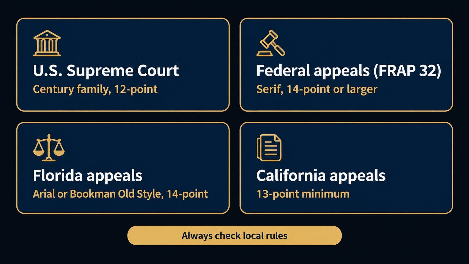
There is no single court font. The U.S. Supreme Court requires a Century-family typeface for booklet-format filings, the federal courts of appeals require a proportional serif face of 14 points or more (or a qualifying monospaced face), and each state sets its own rules, so the only safe answer is the rule for the court you are filing in. Rules change and this section is not legal advice; every rule below was checked on October 22, 2026, and you should confirm the current text before you file.
U.S. Supreme Court: Rule 33 and the Century family
The U.S. Supreme Court requires booklet-format documents to be typeset in a Century-family face at 12 points with at least 2 points of leading. Century Expanded, New Century Schoolbook and Century Schoolbook are the examples the rule names. The current Rules of the Supreme Court were adopted February 17, 2026 and took effect March 16, 2026, and the typeface wording in Rule 33.1(b) is unchanged from the 2023 rules.
The 2026 rules PDF adds the details a typesetter needs. Quotations over 50 words must be indented. Footnotes are 10-point type, also with 2-point or more leading. Text appears on both sides of the page. Rule 33.1(c) sets the physical page: opaque, unglazed paper of at least 60-pound weight, margins of at least three-fourths of an inch, and a text field no larger than 4⅛ by 7⅛ inches including footnotes. Rule 33.1(h) requires a certificate stating the word count, and the preparer may rely on the word processor's count only if it is set to include footnotes.
Rule 33.1(g) sets word limits and cover colors. The most common documents are below.
| Document | Word limit | Cover color |
|---|---|---|
| Petition for certiorari | 9,000 | White |
| Brief in opposition | 9,000 | Orange |
| Merits brief | 13,000 | Light blue (petitioner), light red (respondent) |
| Merits reply | 6,000 | Yellow |
| Amicus brief, petition stage | 6,000 | Cream |
| Petition for rehearing | 3,000 | Tan |
Two points trip people up. First, the Century requirement applies to booklet format only. Rule 33.2 covers documents filed on 8½ × 11-inch paper, such as in forma pauperis filings; it requires double spacing (with indented quotations single spaced) and page limits of 40 pages for a petition or brief in opposition and 15 for a reply, supplemental brief or rehearing petition, but it names no typeface. Second, the Court's electronic filing guidelines (March 2026) ask for PDF/A files, created from a word-processing file and text searchable where possible, with a 100 MB maximum per file. Check the current rule and guidelines before you file.
Federal courts of appeals: FRAP 32
Federal Rule of Appellate Procedure 32 lets a brief use either a proportionally spaced face or a monospaced face. Under FRAP 32(a)(5) (as amended to December 1, 2024), a proportional face "must include serifs, but sans-serif type may be used in headings and captions," and it must be 14-point or larger. A monospaced face may not contain more than 10½ characters per inch. That last limit is a density measure, not a point size.
The rest of the rule covers style and layout. FRAP 32(a)(6) requires "a plain, roman style," with italics or boldface allowed for emphasis, and case names must be italicized or underlined. According to the Cornell LII text of FRAP 32, subdivision (a)(4) calls for 8½ × 11-inch paper, double-spaced text and margins of at least one inch on all four sides, while quotations longer than two lines may be indented and single-spaced and headings and footnotes may be single-spaced.
Length is controlled by FRAP 32(a)(7). A principal brief may not exceed 30 pages, or a reply 15 pages, unless it meets the type-volume limit: no more than 13,000 words for a principal brief (or 1,300 lines in monospaced type) and half that for a reply. FRAP 32(g) requires a certificate of compliance stating the word or line count, and Form 6 satisfies it. FRAP 32(e) matters most for typeface disputes: every court of appeals must accept documents that comply with Rule 32's form requirements, though a court may also accept others by local rule or order. Circuits add their own local rules on top, so check the current circuit rules as well.
Seventh Circuit: the typography guide
The Seventh Circuit publishes the most detailed typography advice of any federal court. "Requirements and Suggestions for Typography in Briefs and Other Papers" runs at pp. 170-77 of the court's Practitioner's Handbook for Appeals (2020 edition) and as a standalone PDF. The requirements part is binding. Circuit Rule 32(b) permits 12-point type in text and 11-point in footnotes, which the guide notes is smaller than FRAP 32(a)(5)(A) would require on its own. The circuit also opted out of FRAP's lower word limits: a principal brief may run 14,000 words and a reply 7,000.
The suggestions part is not binding, and the guide says so plainly: "Nothing in what follows is mandatory." It recommends faces designed for books, notes that the Supreme Court and the Solicitor General use Century, and names New Baskerville, Book Antiqua, Calisto, Century, Century Schoolbook and Bookman Old Style. It adds a line worth remembering: "Any face with the word 'book' in its name is likely to be good for legal work." It also lists Baskerville, Bembo, Caslon, Deepdene, Galliard, Jenson, Minion, Palatino, Pontifex, Stone Serif, Trump Mediäval and Utopia as suitable.
The guide prefers faces with a larger x-height, so "faces in the Bookman and Century families are preferable to faces in the Garamond and Times families," and it says to shun display type such as Bodoni. On Times New Roman, it says the face "was designed for newspapers" and "has a small x-height," and that lawyers, unlike newspaper readers, want to "maximize retention." Helvetica, Arial, Eurostile, Trebuchet, Univers and Verdana appear only as examples of sans-serif faces when the guide explains the serif rule; it does not recommend any of them for body text. Its reading list includes Robin Williams's The PC is not a Typewriter and Robert Bringhurst's The Elements of Typographic Style. The court practices what it advises: its own opinions are set in 12-point Palatino Linotype. Check the current Handbook and Circuit Rule 32 before filing.
D.C. Circuit: the 2021 Garamond notice
The D.C. Circuit discourages Garamond but does not ban it. On March 16, 2021, Clerk Mark J. Langer issued a notice titled "Preferred Typefaces for Briefs" that revised the Circuit Handbook. It says Century and Times New Roman are more legible than other typefaces, "particularly Garamond, which appears smaller," and that briefs in Garamond "can be more difficult to read and the use of this typeface is discouraged."
The notice also acknowledges that FRAP 32(a)(5) requires courts of appeals to accept any proportional serif face of at least 14 points. So a 14-point Garamond brief complies with the rule; it simply ignores the court's stated preference. Most lawyers would rather not start a brief by ignoring the court's preference. Check the current Handbook and any later notices before filing.
Florida: Arial or Bookman Old Style at 14 points
Florida is the clearest example of a state that names exact fonts. Computer-generated filings in Florida's appellate courts must use Arial 14-point or Bookman Old Style 14-point, according to The Florida Bar News. The change took effect at 12:03 a.m. on January 1, 2021, replaced the 2001 requirement of Times New Roman 14-point or Courier New 12-point, swapped page limits for word limits on computer-generated documents, and added a certificate of compliance. The two fonts were chosen after a Bar rules committee asked judges, lawyers and others for their preferences, and the feedback favored them for readability on monitors. The Florida Supreme Court first restricted fonts in 1992.
The rule text below comes from a secondary source, Syfert Law's mirror of rule 9.045, because the Bar's own rules PDF blocks automated access. According to that mirror, Rule 9.045(b) requires black, distinct, double-spaced text, says "Text in script or type made in imitation of handwriting is not permitted," and requires footnotes and quotations in the same size as the body text, with headings at least as large. Rule 9.045(e), per the same mirror, requires a certificate confirming both the font and the word count. Syfert's mirror of rule 9.210 gives limits of 13,000 words for initial and answer briefs, 4,000 for a reply and 2,500 for a jurisdictional brief. Verify all three against the Bar's current PDF before filing.
Florida is also the source of a common error. Arial 14 is a Florida requirement, not a Seventh Circuit recommendation, and it is one of two required options rather than a court's general endorsement.
California: 13-point type, Century Schoolbook preferred
California sets size floors rather than one font, with a stated preference for e-filed documents. Rule 8.204(b) of the California Rules of Court, which governs appellate briefs, says "Any conventional font may be used," proportional or monospaced, in roman style. Type, including footnotes, may not be smaller than 13-point; lines must be at least one-and-a-half spaced; and margins are 1½ inches left and right and 1 inch top and bottom. Rule 8.204(c)(1) caps a computer-produced brief at 14,000 words, including footnotes, with a word-count certificate.
Rule 8.74(b)(1) is stricter for documents prepared for electronic filing in a reviewing court. The font must be a proportionally spaced serif face, and "Century Schoolbook is preferred." Sans serif is allowed for headings, subheadings and captions. Size is 13-point including footnotes, ALL CAPS may not be used for emphasis, lines are 1.5-spaced and paragraphs must be left-aligned rather than justified. Rule 8.74(a)(1) requires text-searchable PDF except where conversion is not practicable. Rule 8.74 was last amended effective July 1, 2026, in subdivision (a).
Trial courts follow a different rule. Rule 2.104 requires papers filed in the trial courts to use a font size not smaller than 12 points. Local rules and individual departments may add more, so check the current rules for your court.
North Carolina, Washington, Texas and Virginia
Four more states show how varied the rules are. North Carolina adopted a comprehensive revision of its appellate rules effective January 1, 2017. According to the North Carolina Bar Association's blog summary, Rule 26(g)(1) requires a proportionally spaced font with serifs, no smaller than 12-point and no larger than 14-point, and names Constantia and Century as examples, so Courier no longer complies. The same summary says Rule 28(j) caps principal briefs at 8,750 words and reply and amicus briefs at 3,750.
For Washington, a March 2026 WSBA Bar News article reports that RAP 18.17 lets filers in the state's appellate courts use any 14-point font, with a serif choice equivalent to Times New Roman or a sans-serif choice equivalent to Arial. The author, Jaclyn C. Celebrezze, recommends Century Schoolbook at 14-point for body text with Avenir or Franklin Gothic at 16-point for headings. That is her suggestion, not the rule.
Texas sets type-size minimums for appellate filings in Rule 9.4 of the Texas Rules of Appellate Procedure; read the current rule on the Texas courts' website rather than relying on a summary. Virginia's Supreme Court posts a list of acceptable fonts separately from its rules, so check the court's current list before you file there.
Court font rules at a glance
The table below collects the rules covered above. "Verified" shows whether the rule was read on the court's own source or on a secondary source, and when.
| Court | Rule | Typeface | Minimum size | Length limit | Verified |
|---|---|---|---|---|---|
| U.S. Supreme Court, booklet | Rule 33.1 | Century family | 12-point text, 10-point footnotes | Word limits by document | 2026-10-22 |
| U.S. Supreme Court, 8½ × 11 | Rule 33.2 | None named | None named | 40 or 15 pages | 2026-10-22 |
| Federal courts of appeals | FRAP 32 | Proportional serif or monospace | 14-point | 13,000 words | 2026-10-22 |
| Seventh Circuit | Circuit Rule 32 | Any FRAP face; book faces suggested | 12-point text, 11-point footnotes | 14,000 words | 2026-10-22 |
| D.C. Circuit | 2021 notice | Garamond discouraged | 14-point (FRAP) | FRAP limits | 2026-10-22 |
| Florida appellate | Rule 9.045 | Arial or Bookman Old Style | 14-point | 13,000 words | Secondary, 2026-10-22 |
| California appellate | Rule 8.204 | Any conventional font | 13-point | 14,000 words | 2026-10-22 |
| California e-filed, reviewing courts | Rule 8.74 | Serif; Century Schoolbook preferred | 13-point | Per 8.204 | 2026-10-22 |
| California trial courts | Rule 2.104 | Not specified | 12-point | Local rules | 2026-10-22 |
| North Carolina appellate | Rule 26(g) | Proportional serif | 12 to 14-point | 8,750 words | Secondary, 2026-10-22 |
| Washington appellate | RAP 18.17 | Any 14-point font | 14-point | Check current rule | Secondary, 2026-10-22 |
| Texas appellate | TRAP 9.4 | Check current rule | Check current rule | Check current rule | Check current rule |
| Virginia Supreme Court | Court's font list | Check current list | Check current rule | Check current rule | Check current rule |
These rows are the jurisdictions verified for this guide, not a 50-state survey. Rules for other states, for trial courts and for individual judges vary widely and change without much notice. For any court not listed here, use the steps in the next section and record what you find, with the date, in your firm's style guide.
Court font myths, AsymaDesign and local rules
Most court-font advice online repeats a handful of errors, and the fix is always the same: read the rule itself, then any local rule and the assigned judge's procedures. This section corrects the most common myths, looks at the one recent opinion that turned a font into the story, and gives a five-step method for finding the rule for any filing.
Seven court-font myths, corrected
Some guides state these as facts. The rules say otherwise.
| Myth | What the rule says | Source |
|---|---|---|
| Courts require 12-point Times New Roman | The Supreme Court requires the Century family; Florida requires Arial or Bookman Old Style at 14 points; Butterick says he has never found a court requiring 12-point Times New Roman | Rule 33.1(b), Typography for Lawyers |
| The Seventh Circuit recommends Arial | Arial appears only as an example of a sans-serif face; the court recommends book serif faces | Seventh Circuit Handbook |
| The Seventh Circuit bans Times New Roman, and the D.C. Circuit bans Garamond | Both are advice; FRAP 32 requires acceptance of any compliant 14-point serif face | D.C. Circuit notice |
| The Supreme Court requires Century Schoolbook for every filing | The Century family is required for booklet format only; Rule 33.2 paper filings name no typeface | Rule 33.2 |
| Sans serif is fine for brief body text in federal appeals | FRAP 32 requires serifs for proportional body text and allows sans serif only in headings and captions | FRAP 32(a)(5) |
| Monospaced type must be 10.5 points | The limit is no more than 10½ characters per inch, a density measure | FRAP 32(a)(5)(B) |
| Calibri is the Supreme Court's font | The UK Supreme Court switched to Calibri in 2021; the U.S. Supreme Court requires the Century family | Legal Cheek |
AsymaDesign: when the font becomes the story
In June 2024 the Seventh Circuit published an opinion that spent part of its length on a brief's typeface. In AsymaDesign v. CBL, No. 23-2495, argued May 29 and decided June 3, 2024, Judge Easterbrook wrote for a panel of Easterbrook, Brennan and Scudder. The opinion notes that the appellant's brief was set in Bernhard Modern, which it calls "a display face suited to movie posters and used in the title sequence of the Twilight Zone TV show."
To make the point visible, the court set two paragraphs of its own opinion in 16-point Bernhard Modern. The rest is in what it calls "the Seventh Circuit's normal type: 12-point Palatino Linotype." The opinion directs lawyers to the Handbook's typography pages (pp. 170-77) and cites Matthew Butterick's Typography for Lawyers (2d ed. 2018) with the line "If you don't believe our Handbook, believe Butterick." It closes: "We hope that Bernhard Modern has made its last appearance in an appellate brief."
The lesson is narrow and practical. A font choice can draw a published rebuke from a federal appellate court, in an opinion anyone can read. The appeal was dismissed for other reasons, so the case does not show that a font loses an appeal; it shows that judges notice type and are willing to say so in print.
How to find the rules for your filing
Use the same five steps for any court, in this order, and stop only when you have checked all five.
- Read the court's own appellate or civil rules for format, typeface, size, spacing and length.
- Read the circuit, district or local rules, which can loosen or tighten the general rule (the Seventh Circuit's 12-point allowance is an example).
- Read the assigned judge's standing order or chambers procedures. For example, one magistrate judge in the Northern District of Illinois notes that Local Rule 7.1 sets a 15-page limit but no typeface or size, then, to discourage Times New Roman and encourage Palatino, Century Schoolbook, Garamond or Book Antiqua, sets word limits of 3,500 words for opening and response briefs and 2,500 for replies, with a word-count certification.
- Read the court's e-filing guide for PDF requirements such as PDF/A, text searchability and file-size caps.
- Call the clerk's office when the rules are unclear or conflict.
Then write down what you found. A one-line entry in the firm's style guide (court, rule number, typeface, size, length limit, date checked) saves the next person from repeating the search and makes it obvious when a rule is due for a re-check.
Why courts count words instead of pages
Courts moved to word limits because fonts at the same nominal size are not the same size on the page. The 1998 Advisory Committee Note to FRAP 32, reproduced by Cornell LII, says 14-point typefaces vary greatly in x-height, so a page limit would reward compact faces. The 1998 limits assumed 280 words per page; the 2016 amendment re-based them on 260, which is why the principal-brief limit fell to 13,000 words.
Under a word limit, a narrow typeface buys no extra argument. It only makes the brief harder to read. The certificates in FRAP 32(g) and Supreme Court Rule 33.1(h) enforce the count, and the Northern District of Illinois order above uses word limits for the same reason.
Best fonts for contracts, letters and legal notices
When no court rule applies, pick one readable book serif at 10 to 12 points for anything that will be printed or read as a PDF, and use it consistently across the firm. Contracts, letters and memos are rarely regulated by font, so the choice is about legibility, consistency and how the document looks on the device the reader actually uses.
Contracts and engagement letters
For contracts and engagement letters, I would start with Century Schoolbook, Book Antiqua, Equity or Cambria. Century Schoolbook comes from a family Microsoft notes "generations of children learned to read with." Book Antiqua is a Monotype design based on pen-drawn Italian Renaissance letters. Butterick describes Equity as a text family he designed for lawyers. Microsoft calls Cambria a serif face "designed for reading long documents onscreen or in print."
Plaintiff firms have one extra constraint. Retainer and engagement agreements in mass tort and personal injury matters are often signed electronically on a phone, so the sizes and spacing you choose must survive a small screen: generous size, clear headings, short paragraphs and no fine print that only works on paper. The mass tort intake guide covers where that signature step sits in the intake process. Contract fonts are rarely regulated, but if your practice touches a consumer-contract statute with its own formatting requirements, check that statute directly.
Client letters, demand letters and memos
Demand packages to insurers, settlement statements, client letters and internal memos should use the same family as the rest of the firm's documents. One family across everything makes the firm's paper recognizable and keeps templates simple. Headings can use a sans serif if you want stronger contrast; FRAP 32 itself allows sans-serif type in headings and captions while requiring serifs in the body, and that division works well outside court too.
The bigger readability gains come from structure, not typeface. A damages summary is easier to check as a short table (item, amount, source document) than as a paragraph of bold figures. Real headings, created with Word's heading styles rather than bold body text, let the reader scan a long demand letter and let Word build a navigation pane. In my view, a settlement statement a client can read in two minutes is worth more than any font choice.
Trial-court pleadings and motions
Trial-court formatting is governed mostly by local rules, which vary more than appellate rules do. California's Rule 2.104, for example, sets a 12-point minimum for papers filed in the trial courts, and individual judges can add preferences, as the Northern District of Illinois order shows. Keep a separate pleading template for each court where the firm files regularly, named by court, and record the rule and the date checked inside the template's properties or the style guide.
Legal notices and publication notices
Published legal notices are governed by the statute that requires the notice and by the newspaper or website that publishes it. Requirements vary by state and by notice type, and the publisher often controls the final typesetting. Before you draft, read the statute for any format, size or wording requirement, then ask the publisher for its specifications. Keep the notice's text in a plain document so the publisher can set it in its own type without reformatting errors.
A starting template for firm documents
The table below is a starting point for a firm's default document template. Court rules override every row when you file.
| Setting | Starting value | Why |
|---|---|---|
| Body font | Century Schoolbook or another licensed book serif | Book faces suit long reading; the Seventh Circuit favors them |
| Size | 12-point | Butterick puts printed body text at 10 to 12 points |
| Line spacing | Multiple at 1.15 | Inside Butterick's 1.03 to 1.24 range, which gives 120 to 145% |
| Paragraph spacing | Space after, not blank lines | Keeps spacing consistent and editable |
| Line length | 45 to 90 characters | Butterick's range for comfortable reading |
| Headings | Same family in bold, or a sans serif | FRAP 32 allows sans serif in headings |
| Emphasis | Italics, not underlining | The Seventh Circuit's guide prefers italics |
| § and ¶ | Nonbreaking space after; double the mark for plurals | Keeps the mark with its number |
| Section sign shortcut | Alt+0167 on the numeric keypad | Microsoft's symbol table |
| Page numbers | Bottom center or bottom right, every page | Lets readers cite pages |
| Fonts on save | Embed fonts in the file | Keeps layout on other computers |
The numeric ranges come from Butterick's pages on point size, line spacing and line length; his rules for paragraph and section marks also say to spell out "Section" at the start of a sentence. The Alt+0167 code is from Microsoft's symbol table. For the full set of shortcuts, see the companion guide to typing § and ¶ in Word.
Word defaults, PDFs and e-filing
Most firm documents use whatever Word's default font was when the template was built, so knowing the default history and setting your own default deliberately matters. This section covers how the default changed, how to set a firm default, how to embed fonts, and how to produce PDFs that courts accept.
From Times New Roman to Calibri to Aptos
Word's default font has changed twice, and many firm templates still carry one of the old defaults. Times New Roman first appeared in 1932 in The Times of London; Microsoft's credit names Stanley Morison and Victor Lardent. Calibri, designed by Lucas de Groot in 2004, became the Office default in 2007, replacing Times New Roman.
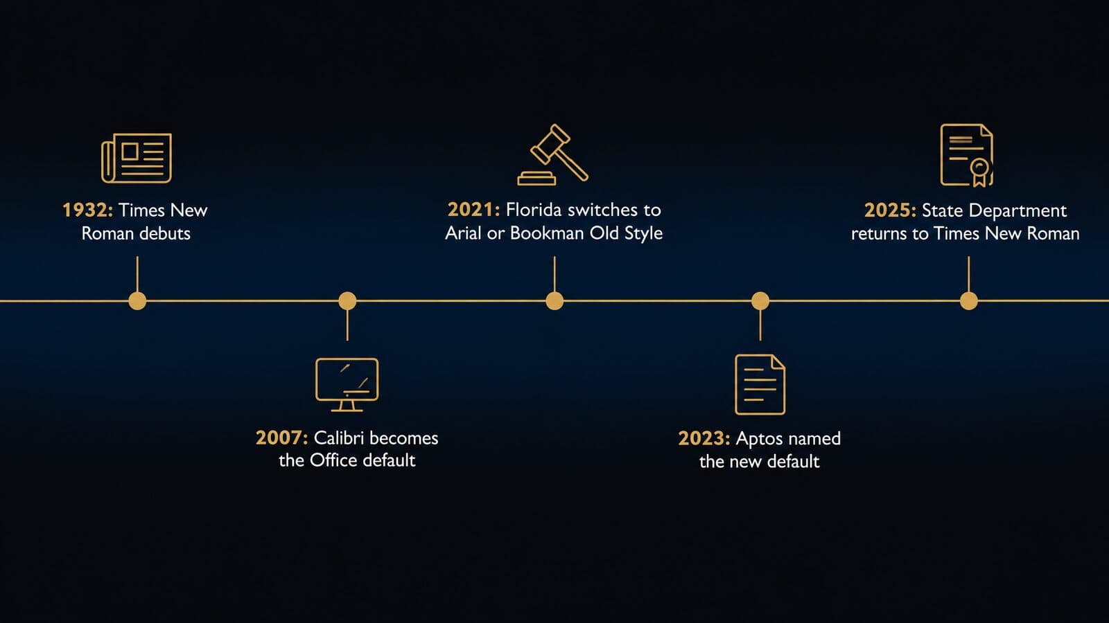
In April 2021, Microsoft commissioned five candidate fonts to replace Calibri: Tenorite, Bierstadt, Skeena, Seaford and Grandview. In July 2023 it announced Aptos, previously Bierstadt, as the new default across Word, Outlook, PowerPoint and Excel, rolling out over the following months. Designer Steve Matteson renamed it after Aptos, California. Aptos has six weights from Light to Black with obliques, plus Display and Condensed styles, and it is an Office cloud font.
| Year | Event | Source |
|---|---|---|
| 1932 | Times New Roman first appears in The Times of London | Microsoft Learn |
| 2007 | Calibri becomes the Office default | Microsoft Learn |
| 2021 | Florida appellate filings switch from Times New Roman to Arial or Bookman Old Style (January 1) | Florida Bar News |
| 2021 | Microsoft commissions five candidate default fonts | Microsoft Design |
| 2023 | Aptos announced as the Office default; State Department adopts Calibri | Microsoft Design |
| 2025 | State Department returns to Times New Roman (December) | AP via Boston Globe |
The practical point is that a template built in 2010 probably uses Calibri, one built recently probably uses Aptos, and one inherited from an older practice may still use Times New Roman. None of them was chosen for legal reading. Pick the firm's font on purpose and set it in the template.
Government font switches in 2023 and 2025
Governments change official fonts too, and the changes get press coverage. AP reported, in a story carried by the Boston Globe, that on December 9, 2025 Secretary of State Rubio sent a cable to all U.S. embassies and consulates ordering diplomatic correspondence back to Times New Roman, effective December 10. That reversed a 2023 switch to Calibri under Secretary Blinken. A separate memo said documents for international treaties and presidential appointments use Courier New 12-point.
ABC reported that the directive also mandates size 14, and that the 2023 Calibri switch was recommended in part to help readers with low vision and dyslexia. Across the Atlantic, Legal Cheek reported that the UK Supreme Court used Times New Roman for judgments on its website until early October 2021, then switched to Calibri. That is the UK court; the U.S. Supreme Court's rule is unchanged.
How to set your firm's default font in Word
Setting the default takes a minute. These steps follow Microsoft's support page.
- On Windows, open the Font dialog launcher on the Home tab, or press
Ctrl+D. - Choose the font and size the firm has standardized on.
- Select Set As Default.
- Choose "All documents based on the Normal template?" and confirm.
- If the change does not stick, check that Normal.dotm is not read-only.
- On a Mac, go to Format > Font > Font, or press
Command+D, then select Default and confirm with Yes.
In my opinion, a firm-wide template distributed to every machine is better than asking each person to change their own default. A shared template carries heading styles, margins, page numbers and the firm's font together, and updating it once updates the whole firm.
Embedding fonts and producing court-ready PDFs
Embedding fonts keeps a document's layout intact on a computer that lacks the font. In Word, go to File > Options > Save and select "Embed fonts in the file," according to Microsoft's guidance on embedding. "Embed only the characters used" makes the file smaller but limits editing by others. Font makers set embedding permissions of Non-embeddable, Preview/Print, Editable or Installable, so a font's license can stop it from embedding. Office cloud fonts download automatically and rarely need embedding.
For court filings, the verified PDF requirements are specific. The Supreme Court's e-filing guidelines ask for PDF/A, text searchable where possible. California's Rule 8.74(a)(1) requires text-searchable PDF. The Northern District of Illinois magistrate judge's procedures require briefs to be printed to PDF from the word-processing file rather than scanned, so the text stays searchable. Export from Word or a PDF tool that preserves the text layer, open the result, and confirm that you can select and search the text before you file.
Metric-compatible fonts for shared documents
When co-counsel or clients do not have the firm's fonts, metric-compatible substitutes keep line breaks and page counts stable. Tinos and Arimo, both by Steve Matteson, are metrically compatible with Times New Roman and Arial, and Carlito is metric-compatible with Calibri. A document set in Times New Roman will lay out the same on a machine that substitutes Tinos, so page references in a brief or contract do not shift.
With the rules and mechanics settled, the next sections compare the fonts themselves.
Law font comparison table: 24 fonts at a glance
The table below compares all 24 law fonts profiled in this guide by type, where you get them, what they cost and how courts treat them. Unless a court rule or a client's style guide says otherwise, pick from the top of each list: the first twelve rows are for briefs, contracts and letters, and the second twelve are for websites, brands and screens.
| Font | Type | Source | Cost (Oct 2026) | Court notes | Best use |
|---|---|---|---|---|---|
| Century Schoolbook | Serif | Office; MyFonts | Included with Office; family $125.99 | SCOTUS Century family; CA preferred | Briefs, contracts |
| Book Antiqua and Palatino | Serif | Office; Windows | Included | Named by 7th Cir. | Briefs, opinions, letters |
| Bookman Old Style | Serif | Office | Included | Florida option at 14-point | Florida filings, briefs |
| Equity | Serif | MB Type | From $119, one-time | Fine under FRAP serif rule | Firm-wide document face |
| Baskerville | Serif | Microsoft font list; versions vary | Check your install | Named by 7th Cir. | Briefs, formal letters |
| Georgia | Serif | Windows | Included | Not on 7th Cir. book list | Screen-read documents, email |
| Cambria | Serif | Microsoft ClearType collection | No separate price published | Proportional serif | Contracts, memos |
| Constantia | Serif | Windows | Included | Named in NC rule (per NCBA) | Briefs, letters |
| Garamond | Serif | Office | Included | D.C. Cir. discourages | Print pieces, sized up |
| Times New Roman | Serif | Windows | Included | Accepted widely; 7th Cir. critical | Drafts, legacy templates |
| Arial | Sans serif | Windows | Included | Florida option; not FRAP body text | Florida filings, headings |
| Aptos and Calibri | Sans serif | Office; Windows | Included | Not FRAP body text | Internal email, notes |
| Open Sans | Sans serif | Google Fonts | Free (OFL) | Web use | Website body text |
| Lato | Sans serif | Google Fonts | Free, Google Fonts | Web use | Website body, UI |
| Inter | Sans serif | Google Fonts | Free, Google Fonts | Web use | Website body, UI |
| Roboto | Sans serif | Google Fonts | Free, Google Fonts | Web use | Website body, forms |
| Montserrat | Sans serif | Google Fonts | Free, Google Fonts | Web use | Headings |
| Merriweather | Serif | Google Fonts | Free, Google Fonts | Web use | Blog and article text |
| Libre Baskerville | Serif | Google Fonts | Free, Google Fonts | Web use | Web body, headings |
| EB Garamond | Serif | Google Fonts | Free (OFL) | Web use; size up | Headings, quotes |
| Helvetica | Sans serif | MyFonts | Family $460.99 | Sans: not FRAP body text | Brand, signage |
| Verdana and Tahoma | Sans serif | Microsoft | See Microsoft Learn | Sans: not FRAP body text | System fallbacks |
| Century Gothic | Sans serif | Office | Included | Sans: not FRAP body text | Headlines, signage |
| Attorney | Not published | MyFonts (Schriftlabor) | Styles from $19; family $199 | Not for filings | Wordmarks, headings |
Read the table from left to right. "Source" tells you whether the font is already on a firm's Windows or Office machines, free from Google Fonts, or a paid license. "Court notes" compress the rules covered earlier in this guide into a few words; they are pointers, not substitutes for the current rule. Prices are list prices as of October 2026 and change often, so confirm with the vendor.
You may notice that Times New Roman sits at number 10, not number 1. That is deliberate. It is available everywhere and it is compact, but the Seventh Circuit's typography guidance says it "was designed for newspapers" and has a small x-height, and the D.C. Circuit's 2021 notice ranks it as more legible than Garamond, not as the best choice. Matthew Butterick adds that he has never found a court that requires 12-point Times New Roman. It is acceptable, which is different from recommended.
The 12 best fonts for briefs, contracts and letters
The best fonts for legal documents are book serif faces with a generous x-height: Century Schoolbook, Book Antiqua or Palatino, and Bookman Old Style lead the list, followed by a professional face such as Equity if you are willing to buy one. The order reflects how well each face fits long legal reading and the court guidance covered earlier, including the Seventh Circuit's advice to use faces "designed for books" and the D.C. Circuit's comments on Garamond.
This is my ranking, not a survey of what firms use. Nobody has published reliable data on which fonts lawyers set their documents in, so I have weighted three things: what the rules allow or prefer, what courts have said about legibility, and what each font's maker says it was designed for. A markdown article cannot show live type specimens, so each profile describes the letterforms in words and links the vendor's specimen page, where you can type your own sample text.
Each profile opens with a spec line: type, designer and year, where it ships, license and cost, and a one-line court note. Where a field has no published fact, it says so.
1. Century Schoolbook and the Century family
Type: Serif (Scotch-style book face) · Designer and year: Linn Boyd Benton with T. L. De Vinne (original Century); Morris Fuller Benton (Schoolbook, from about 1919, best known version 1924) · Ships with or source: Microsoft Office; MyFonts · License and cost: Included with Office; New Century Schoolbook LT family $125.99 on MyFonts as of October 2026 · Court notes: Supreme Court booklet briefs require a Century family face; California prefers Century Schoolbook
Century began as a face cut for Century magazine; Butterick's Century Schoolbook alternatives page dates Linn Boyd Benton's original to 1894. The Schoolbook versions were drawn for clarity in children's books, and Microsoft's Century Schoolbook page notes that "generations of children learned to read with this font." In practice that means sturdy serifs, open counters, moderate stroke contrast and a large x-height, which is exactly what the Seventh Circuit says makes faces in the Century family preferable to Garamond and Times.
Best for: briefs, motions, contracts and any document a judge or client will read at length. It is the one face that satisfies the Supreme Court's Rule 33.1(b) for booklet filings and California's stated preference in Rule 8.74. Watch out for its width: it sets wider than Times, so a page-limited document will run longer. If you want the same Scotch-style feel from a professional foundry, Butterick lists Century Supra, his own take on the style, which MB Type sells from $119 as of October 2026.
2. Book Antiqua and Palatino
Type: Serif (Renaissance-inspired) · Designer and year: Hermann Zapf, 1950 (Palatino); Monotype (Book Antiqua) · Ships with or source: Palatino Linotype with Windows; Book Antiqua with Office · License and cost: Included · Court notes: Both named by the Seventh Circuit; its own opinions use 12-point Palatino Linotype
Palatino is Hermann Zapf's 1950 design, and Palatino Linotype is a digital version with extra characters he drew. Microsoft calls it "highly legible whether displayed on the screen or in print" and suited to extended text such as books. Book Antiqua is a Monotype design based on pen-drawn letters of the Italian Renaissance, so the two share calligraphic, slightly angled strokes and elegant, readable proportions.
Best for: appellate briefs, opinions, memos and client letters that need to look considered without looking fussy. The Seventh Circuit names both, and the court's opinion in AsymaDesign notes that most of it is set in "12-point Palatino Linotype." One magistrate judge in the Northern District of Illinois also encourages Palatino and Book Antiqua over Times New Roman. Watch out for substitution: they are separate fonts from different makers, so set one name in your template and check that every machine has it.
3. Bookman Old Style
Type: Serif (transitional, despite the name) · Designer and year: A. C. Phemister, about 1858, for Miller & Richard; Monotype version credited to Ong Chong Wah · Ships with or source: Microsoft Office · License and cost: Included · Court notes: One of Florida's two required options at 14-point; Seventh Circuit prefers the Bookman family for x-height
Bookman descends from Oldstyle Antique, and Microsoft's Bookman Old Style page classes it as transitional even though "Old Style" is in the name. It is a broad, heavy-shouldered face with low stroke contrast and a very large x-height. Letters hold up well at small sizes, on tired eyes and on screens, which is why the Seventh Circuit names the Bookman family when it explains that larger x-heights read better.
Best for: Florida appellate filings, where computer-generated documents must use Arial 14-point or Bookman Old Style 14-point, and any brief where maximum legibility matters more than elegance. Watch out for width. Bookman is wide and uses more lines per page than Times or Garamond. Under word limits that does not matter, because the limit counts words, not pages, which is the reason the federal rules moved to word counts. It does matter in page-limited trial court filings and in contract templates with fixed layouts.
4. Equity
Type: Serif (text family) · Designer and year: Matthew Butterick; year not published · Ships with or source: MB Type · License and cost: $119 for 1 to 2 people, one-time, as of October 2026 · Court notes: A proportional serif, so it fits FRAP's serif rule; check local rules
Butterick describes Equity on his Times New Roman alternatives page as "a text family I designed for lawyers," and says it fits about as much text on the page as Times New Roman. That makes it a candidate for firms that want a more readable face without changing page counts. The download contains 96 files: 12 styles, standard and tabular variants, and OpenType variants in OTF, TTF and WOFF2.
Best for: firms willing to pay for a professional document face and standardize on it. The Equity price list runs from $119 for 1 to 2 people to $959 for 81 to 100, as a one-time payment with a 30-day refund, and the standard license includes PDF, app, e-book and webfont embedding. The MB Type license carves out documents a law office makes for clients, such as letters and court filings, from its limits on who may use the fonts. Watch out for sharing: read-write copies may be embedded only in files shared with fewer than 20 people, so co-counsel editing your Word file may see a substitute. Prices are as of October 2026; confirm with the vendor.
5. Baskerville
Type: Serif (transitional) · Designer and year: Baskerville Old Face is based on the Fry foundry version issued in 1766 · Ships with or source: Microsoft font list; versions vary by machine · License and cost: Check which version your machines have · Court notes: Seventh Circuit names New Baskerville and Baskerville
Microsoft's Baskerville Old Face page calls Baskerville "the first of the transitional romans." Transitional faces sit between the angled, calligraphic old-style faces and the high-contrast moderns: the stress is more vertical, strokes show more contrast, and the serifs are sharper. The result looks formal and crisp on paper, which suits engagement letters and briefs alike.
Best for: briefs and formal correspondence where you want a classic book look that the Seventh Circuit lists by name. Watch out for version confusion. "Baskerville" is the name of many different digital fonts, and Baskerville Old Face, New Baskerville and other cuts differ in weight, width and x-height. Before you write a template around it, check which Baskerville is installed on every machine in the firm and in your PDF workflow. For websites, the free Libre Baskerville covered in the next list is the practical counterpart.
6. Georgia
Type: Serif (screen serif) · Designer and year: Matthew Carter; added to Core fonts for the Web on 1 November 1996 · Ships with or source: Windows · License and cost: Included · Court notes: A proportional serif; not on the Seventh Circuit's book list
Georgia was drawn for clarity at low screen resolutions, and Microsoft's Georgia page traces its ancestry to Didot and Scotch Roman. It has a large x-height, sturdy serifs and relatively wide letters, so it stays readable at small sizes on a laptop.
Best for: documents read mainly on screen, such as client email, internal memos and PDFs sent for review on a phone. Watch out for two things. It is not on the Seventh Circuit's list of book faces, so for briefs I would pick a face from the top of this list instead. And Butterick argues that on today's high-resolution screens the old screen-optimized fonts, Georgia among them, no longer have a special benefit. Georgia is a sound, readable choice, not a necessary one.
7. Cambria
Type: Serif · Designer and year: Jelle Bosma, 2004 · Ships with or source: Microsoft ClearType collection · License and cost: No separate price published · Court notes: A proportional serif, so it fits FRAP's serif rule
Microsoft's Cambria page calls it "a text typeface with serifs designed for reading long documents onscreen or in print," and says Bosma drew it to be a potential replacement for Times New Roman. It has even spacing, sturdy serifs and moderate contrast, and it holds its shape at small sizes. It also carries an extensive set of math symbols, which can help in damages calculations or technical exhibits.
Best for: firms that want a Microsoft-supplied serif sturdier than Times for contracts, memos and letters, without buying anything. Watch out for its tone. Cambria reads as practical rather than bookish, and it is not one of the faces the Seventh Circuit lists as designed for books. It is a good default for transactional work and internal documents; for a brief to a court that publishes typeface advice, Century Schoolbook or Book Antiqua sends a clearer signal.
8. Constantia
Type: Serif · Designer and year: John Hudson; year not published · Ships with or source: Windows · License and cost: Included in Windows; other uses licensed from Tiro Typeworks or Monotype · Court notes: Named as an example in North Carolina's appellate font rule, per the NC Bar Association
Microsoft's Constantia page says its fonts can be licensed from Tiro Typeworks or Monotype for uses outside Microsoft products, including webfonts and app embedding. It is a proportionally spaced serif, which is what the North Carolina rule below asks for.
Best for: briefs and letters, especially in North Carolina, where the NC Bar Association's summary reports that Rule 26(g)(1) requires a proportionally spaced serif font and names Constantia and Century as examples. Confirm the current rule text with the court before you rely on the summary. Outside Microsoft software, such as on a website, you need a separate license.
9. Garamond
Type: Serif (old style) · Designer and year: Monotype, 1922, based on Jean Jannon's 1615 types after Claude Garamond · Ships with or source: Microsoft Office · License and cost: Included · Court notes: The D.C. Circuit discourages it; FRAP still requires acceptance of any proportional serif of 14 points or more
Microsoft's Garamond page credits Monotype's 1922 version and its roots in Jannon's 1615 types. Garamond has a small x-height, delicate serifs and light, elegant strokes, which is why it looks refined in a printed book and why it looks small next to other faces at the same point size. The D.C. Circuit's 2021 notice on preferred typefaces says it "appears smaller" and discourages it for briefs.
Best for: printed pieces where elegance matters more than density, such as announcements, firm histories or a printed brochure, set a size larger than usual. Watch out for the courts. The D.C. Circuit discourages Garamond while acknowledging that FRAP requires courts of appeals to accept any proportional serif face of at least 14 points, and the Seventh Circuit prefers Bookman and Century over Garamond. One Northern District of Illinois magistrate judge accepts Garamond but asks for 14-point type. If you use it in a filing, size it up and check the court.
10. Times New Roman
Type: Serif · Designer and year: Stanley Morison and Victor Lardent with Monotype, 1932 · Ships with or source: Windows · License and cost: Included · Court notes: Accepted widely; the Seventh Circuit advises against it; Florida dropped it in 2021
Times New Roman first appeared in The Times of London in 1932, and Microsoft's Times New Roman page says it was adapted "to give excellent legibility coupled with good economy." Economy is the key word: it is narrow, with a small x-height and tight spacing, so it fits a lot of text on a page. That was the right design for a newspaper column. The Seventh Circuit says it is wrong for documents where readers want to retain detail rather than skim.
Best for: drafts, legacy templates and documents that must exchange cleanly with anyone, because it is installed almost everywhere. It is fair to say it remains widely accepted, and AP reported that the State Department returned diplomatic correspondence to it in December 2025. Watch out for the myth that courts require it. Florida replaced its old Times New Roman option in 2021, and Butterick says many lawyers "erroneously assume" courts demand it. If you want the same economy with better legibility, Butterick suggests Equity, Tiempos and Verdigris as alternatives.
11. Arial
Type: Sans serif · Designer and year: Robin Nicholas, later with Patricia Saunders, Monotype, 1982 · Ships with or source: Windows · License and cost: Included · Court notes: One of Florida's two required options at 14-point; not allowed for FRAP body text
Arial was designed for low-resolution laser printers, and Microsoft's Arial page says it has more humanist characteristics than many of its predecessors. It has a medium x-height, even stroke weight and plain, familiar shapes. It is one of the few sans serifs any court rule names as a body-text option.
Best for: Florida appellate filings, where Arial 14-point is one of the two required options, and for headings and captions elsewhere. Watch out for federal appeals. FRAP 32(a)(5) requires a serif face for proportional body text and allows sans serif only in headings and captions, and the Seventh Circuit mentions Arial only as an example of a sans-serif face, not as a recommendation. Washington, according to a WSBA Bar News article, lets filers use any 14-point font equivalent to Times New Roman or Arial; confirm that rule before relying on it.
12. Aptos and Calibri
Type: Sans serif · Designer and year: Steve Matteson (Aptos, Office default since 2023); Lucas de Groot (Calibri, 2004, default 2007 to 2023) · Ships with or source: Aptos is an Office cloud font; Calibri ships with Windows · License and cost: Included · Court notes: Sans serif, so not allowed for FRAP body text
Aptos replaced Calibri as the default in Word, Outlook, PowerPoint and Excel from 2023. It has six weights from Light to Black with obliques, plus Display and Condensed styles. Microsoft's Calibri page calls Calibri "an extremely readable sans serif text typeface" for long texts on screen. Both have rounded, humanist shapes and compact widths. If a recipient lacks Calibri, the free Carlito is metric-compatible, so line breaks hold.
Best for: internal email, meeting notes and drafts, where the default saves effort. For client-facing documents and anything filed, I would switch to a book serif from the top of this list; that is my opinion, and it matches the federal rule for briefs. Both fonts come up often in lawyers' online font debates, as Legal Cheek's summary of a Reddit thread shows, but that is anecdote, not usage data.
The 12 best fonts for law firm websites and brands
For screens, sturdy sans serifs and screen-tuned serifs with large x-heights work best, and most of the strongest options are free on Google Fonts. The work is in choosing two or three, licensing them correctly and loading them well, which matters as much as the choice itself when you plan law firm website design.
The ranking below weighs legibility on phones, the breadth of weights and styles, cost and license terms, and what lawyer websites already use. Free does not mean unlicensed: Google Fonts families carry open licenses, and paid families such as Helvetica and Attorney need a webfont license separate from a desktop one.
What lawyer websites actually use
The only public dataset on lawyer-site fonts measures Google Fonts, not every font. ILOVEWP's crawl, updated November 23, 2024, counted 42,966 lawyer websites that load Google Fonts and ranked the families they use. It is a third-party crawl, and the share column is a share of sites using Google Fonts, not of all law firm websites.
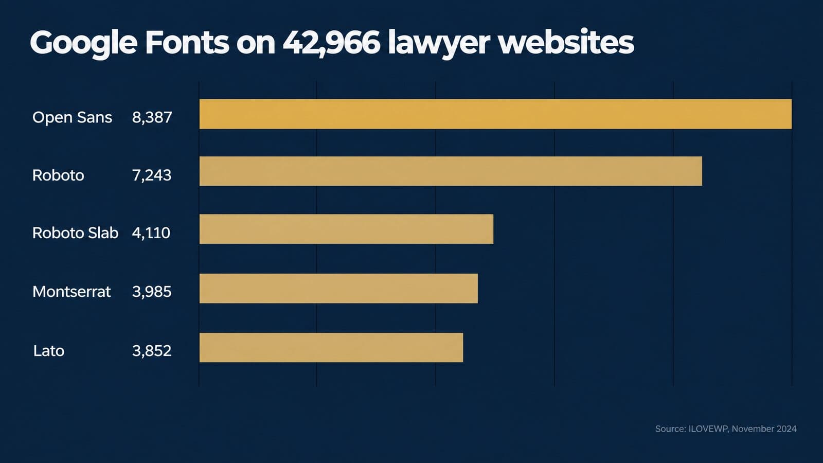
| Rank | Font | Sites | Share |
|---|---|---|---|
| 1 | Open Sans | 8,387 | 19.52% |
| 2 | Roboto | 7,243 | 16.858% |
| 3 | Roboto Slab | 4,110 | 9.566% |
| 4 | Montserrat | 3,985 | 9.275% |
| 5 | Lato | 3,852 | 8.965% |
| 6 | Raleway | 2,573 | 5.988% |
| 7 | Source Sans Pro | 2,270 | 5.283% |
| 8 | Poppins | 2,202 | 5.125% |
| 9 | Playfair Display | 1,975 | 4.597% |
| 10 | Oswald | 1,360 | 3.165% |
Further down the same list, Merriweather ranks 12th, Libre Baskerville 15th, EB Garamond 31st and Inter 44th, on 256 sites. For contrast, Google's own popularity ordering in its font metadata puts Roboto 2nd, Open Sans 3rd, Inter 5th, Montserrat 7th, Poppins 8th and Lato 9th; that is Google's ranking across all its users, not a usage percentage for lawyers.
Some guides say Times New Roman and Helvetica are the most popular fonts on law firm websites, or that nearly a quarter of lawyer sites use Open Sans. The data says something narrower: among lawyer sites that load Google Fonts, Open Sans leads at 19.52%, followed by Roboto. Popularity is not a reason to pick a font, but it does show that plain, sturdy sans serifs dominate. For examples of how these fonts look in finished layouts, see our review of the best law firm websites.
1. Open Sans
Type: Sans serif (humanist) · Designer and year: Steve Matteson; added to Google Fonts in 2011 · Ships with or source: Google Fonts · License and cost: Free (OFL) · Court notes: Web use
Open Sans is a humanist sans serif with open letter shapes, a generous x-height and even spacing. It is a variable font with width and weight axes, so one file can cover body text, bold headings and narrower labels. It ranks first on lawyer sites in the ILOVEWP crawl and third in Google's popularity ordering.
Best for: website body text, forms and practice-area pages that need to read cleanly on a phone. Watch out for sameness. Because it is so common, Open Sans will not distinguish a firm on its own; pair it with a distinctive heading face or a strong logo rather than expecting the body font to carry the brand.
2. Lato
Type: Sans serif · Designer and year: Łukasz Dziedzic, started 2010 · Ships with or source: Google Fonts · License and cost: Free, Google Fonts · Court notes: Web use
Lato means "summer" in Polish, and Warsaw-based Łukasz Dziedzic started it in the summer of 2010. Carlito, the metric-compatible stand-in for Calibri, is derived from it. It ranks fifth on lawyer sites in the ILOVEWP crawl.
Best for: firms that want a slightly warmer sans serif for body text and interface labels, such as family law or estate planning practices. Watch out for the lighter weights, which can look faint on low-contrast backgrounds; use regular or heavier for body copy.
3. Inter
Type: Sans serif · Designer and year: Rasmus Andersson; year not published here · Ships with or source: Google Fonts · License and cost: Free, Google Fonts · Court notes: Web use
Inter was designed for computer screens and has a tall x-height. It is a variable font with optical-size and weight axes, which lets the same family tighten up for large headlines and open up for small text. Disclosure: this site is set in Inter, and a later section explains how it loads.
Best for: websites, intake forms, dashboards and anything with dense interface text. Watch out for its neutrality. It ranks only 44th among lawyer sites in the crawl but 5th in Google's ordering, which means it is common on the web generally; like Open Sans, it needs a heading face, color or logo to give a firm character.
4. Roboto
Type: Sans serif · Designer and year: Christian Robertson, with ParaType and Font Bureau; variable since July 2020 · Ships with or source: Google Fonts · License and cost: Free, Google Fonts · Court notes: Web use
Roboto is a compact, mechanical-looking sans serif with open curves. Since July 2020 it has been a variable font with weight and width axes. It ranks second on lawyer sites in the ILOVEWP crawl, and its sibling Roboto Slab ranks third.
Best for: body text, buttons and form fields where you want a lot of text in limited space. Watch out for density on small screens: its compact width is efficient, so give it enough line spacing. Roboto Slab, its slab-serif sibling, can provide a heading contrast within the same visual system.
5. Montserrat
Type: Sans serif (geometric) · Designer and year: Julieta Ulanovsky, with Sol Matas, Juan Pablo del Peral and Jacques Le Bailly · Ships with or source: Google Fonts · License and cost: Free, Google Fonts · Court notes: Web use
Montserrat was inspired by old posters and signs in the Montserrat neighborhood of Buenos Aires. It has wide, round, geometric letters with a strong presence in bold weights. It ranks fourth on lawyer sites in the ILOVEWP crawl.
Best for: headings, navigation, buttons and short taglines. In my view it is heavy and wide for long body text, so pair it with a more compact text face. Watch out for all-caps settings: wide geometric capitals take a lot of room on a phone.
6. Merriweather
Type: Serif (screen serif) · Designer and year: Sorkin Type; year not published here · Ships with or source: Google Fonts · License and cost: Free, Google Fonts · Court notes: Web use
Merriweather was designed as a text face that is pleasant to read on screens, with a very large x-height. It ranks 12th on lawyer sites in the ILOVEWP crawl.
Best for: blog posts, legal guides and FAQ pages where a firm wants a bookish, authoritative serif on screen. Watch out for size: because its x-height is so large, it can look oversized next to a sans serif at the same pixel size, so test the pairing and adjust.
7. Libre Baskerville
Type: Serif (transitional) · Designer and year: Impallari Type, based on ATF's 1941 Baskerville · Ships with or source: Google Fonts · License and cost: Free, Google Fonts · Court notes: Web use
Libre Baskerville is optimized for body text at about 16px and has a taller x-height than its 1941 model. It keeps the crisp, formal look of a transitional Baskerville while adjusting proportions for screens. It ranks 15th on lawyer sites in the ILOVEWP crawl.
Best for: firms that set their documents in Baskerville and want the website to match, and for headings that should feel traditional. It is the web counterpart to the Baskerville profile in the first list. Watch out for its width, which is generous; give it a comfortable column rather than a narrow sidebar.
8. EB Garamond
Type: Serif (old style) · Designer and year: Georg Duffner and Octavio Pardo; revival from the 1592 Berner specimen · Ships with or source: Google Fonts · License and cost: Free (OFL) · Court notes: Web use; size up
EB Garamond revives Claude Garamond's 16th-century types from the 1592 Berner specimen. It has the light strokes, small x-height and graceful italic of a classic old-style face. It ranks 31st on lawyer sites in the ILOVEWP crawl.
Best for: headings, pull quotes and short introductory text on firm sites that want a literary, established tone. Watch out for size. The D.C. Circuit noted that Garamond appears smaller than other faces, and the same is true on screen, so set EB Garamond larger than you would a sans serif and avoid it for small body text.
9. Helvetica
Type: Sans serif (neo-grotesque) · Designer and year: Max Miedinger and Eduard Hoffmann, released as Neue Haas Grotesk in 1957; renamed in 1960 · Ships with or source: MyFonts (Linotype) · License and cost: Family of 30 fonts $460.99 on MyFonts as of October 2026 · Court notes: Sans serif, so not for FRAP body text
According to MyFonts' Helvetica page, Linotype renamed Neue Haas Grotesk to Helvetica in 1960, from the Latin name for Switzerland. Windows does not bundle it; Arial is the sans serif Microsoft ships.
Best for: signage, stationery and brand systems where a firm wants a neutral, Swiss-modernist look and is ready to pay for it. Watch out for licensing. A desktop license does not automatically cover webfont use, and webfont pricing is not covered here; check the terms before you put it on a website.
10. Verdana and Tahoma
Type: Sans serif (humanist) · Designer and year: Matthew Carter; Verdana hand-hinted by Tom Rickner · Ships with or source: Microsoft · License and cost: See Microsoft Learn · Court notes: Sans serif, so not for FRAP body text
Microsoft's Verdana page says the family resembles humanist sans serifs such as Frutiger and was created for on-screen display. Tahoma is its narrower cousin.
Best for: system fallbacks in a website font stack and plain-text email. Watch out for the advantage fading. Butterick argues that on high-resolution screens these screen-optimized fonts no longer have a special benefit, so they are reliable backups, not reasons to skip a well-chosen webfont.
11. Century Gothic
Type: Sans serif (geometric) · Designer and year: Based on Monotype 20th Century, drawn by Sol Hess between 1936 and 1947 · Ships with or source: Microsoft Office · License and cost: Included · Court notes: Sans serif, so not for FRAP body text
Century Gothic has an enlarged x-height and round, geometric letters, and Microsoft suggests it for headlines and display.
Best for: headlines, signage and presentation titles, in my view. Watch out for long text: its wide, round shapes make paragraphs tiring and use a lot of space, so keep it out of body copy and documents.
12. The Attorney typeface
Type: Classification not published on the vendor page used here · Designer and year: Viktor Solt-Bittner; published by Schriftlabor, Vienna · Ships with or source: MyFonts · License and cost: Styles from $19.00; family $199.00 on MyFonts as of October 2026 · Court notes: Not for filings
If you searched for an "attorney font," this is the typeface with that name. MyFonts' Attorney page says Solt-Bittner originally developed it as a custom font for a law firm, hence the name. It has nine weights from Extralight to Black, each with an italic, for 18 styles.
Best for: a wordmark, headings or signage for a firm that wants a face with a legal backstory. Watch out for licensing. The listed prices are for the fonts on MyFonts as of October 2026; webfont and app licensing may be separate, so confirm terms with the vendor before you use it on a site.
Fonts to avoid in legal documents and marketing
Avoid novelty, script and display faces for any text a client, court or opposing counsel must read, and avoid condensed or monospaced type unless a rule requires it. These faces either cut legibility, break a rule, or signal the wrong tone in a profession where readers judge care by presentation.
Novelty, script and handwriting fonts
Comic Sans MS, conceived by Vincent Connare in 1994 and first shipped with the Windows 95 Plus! pack according to Microsoft's Comic Sans page, was designed for casual on-screen text, not legal documents. Butterick says novelty, script and handwriting fonts have "no place in any document created by a lawyer." Florida's rule, according to Syfert's mirror of the rules, states that script or type imitating handwriting is not permitted. Decorative "law" fonts from free download sites belong on posters, if anywhere; the sourcing and licensing section later in this guide explains where to get fonts safely.
Display faces in body text
Display faces are drawn for large sizes, such as headlines, posters and title screens, and they break down at text sizes. The AsymaDesign brief set in Bernhard Modern, covered earlier, is the cautionary example. The Seventh Circuit's guidance also tells lawyers to shun display type such as Bodoni. A display face can work in a firm logo or a large website headline; it does not belong in paragraphs a judge or client must read.
Condensed and compressed type
The Seventh Circuit reads FRAP 32(a)(6) to make condensed type "not acceptable" in briefs. Condensed styles also hurt legibility on phones, in my view, because narrow letters crowd together at small sizes. Aptos ships with a Condensed style for tight layouts, not for body text in a brief or on a web page.
Courier and other monospaced fonts
Courier was designed by Howard "Bud" Kettler in 1955 or 1956 for IBM typewriters, and Courier New is monospaced, so every character has the same width. FRAP 32(a)(5) still allows a monospaced face of no more than 10½ characters per inch, but the Seventh Circuit advises against it in guidance it labels non-binding. North Carolina's 2017 rule requires a proportionally spaced serif font, according to the NC Bar Association, so Courier does not comply there. Florida dropped its Courier New 12-point option in 2021. According to AP, the State Department still uses Courier New 12-point for international treaties and presidential appointments. For everyday legal and marketing work, keep monospace for code and data.
Once the individual fonts are chosen, a firm needs a system that keeps them consistent across briefs, letters, the website and ads, which is where the next section begins.
Building a law firm type system and font pairings
A type system names one or two font families, gives each one a job, and writes the sizes down, so the website, ads, letterhead and Word templates all look like they came from the same firm. Without that written record, every vendor, paralegal and freelance designer picks fonts on their own, and the firm slowly ends up with five.
Primary, secondary and utility fonts
Most firm type systems work best with three roles. The primary font carries headings, the logo lockup and anything that has to look like the brand. The secondary font carries body text: web paragraphs, letters, intake forms and long reading. The utility font is the fallback for places where the firm cannot control what gets installed, such as email, Word documents that opposing counsel will edit, and PDFs produced by co-counsel.
This is the same discipline as the 3 font rule covered earlier: two families plus a fallback, never a new font per project. In some systems the primary and secondary roles collapse into one family, with weight and size doing the work of separation.
Variable fonts make that easier. A single variable file can hold every weight from light to black, and the Next.js font documentation recommends variable fonts for that reason. Open Sans and Inter are both published as variable fonts on Google Fonts, so one file can cover body, headings and buttons. Fewer files also means fewer chances for a missing weight to fall back to a faux bold that the browser generates on the fly.
Seven font pairings that work for law firms
These seven pairings are my recommendations, not rules. Each uses fonts profiled earlier in this guide, and each pairs a face with a clear job for headings with one built for long reading. Test any pairing at real sizes on a phone before committing, because two fonts that look good together in a design file can feel mismatched at 16px.
| Pairing | Headings | Body | Why it works | Watch out |
|---|---|---|---|---|
| 1. Inter alone | Inter, heavier weights | Inter, regular | One variable family; tall x-height built for screens | Can feel generic without color and spacing choices |
| 2. Montserrat + Merriweather | Montserrat | Merriweather | Geometric sans heads, serif with a very large x-height for reading | Montserrat runs wide; keep headings short |
| 3. Libre Baskerville + Open Sans | Libre Baskerville | Open Sans | Traditional serif voice over a humanist sans body | Libre Baskerville is tuned for about 16px body, so test it larger as a heading |
| 4. EB Garamond + Lato | EB Garamond | Lato | Classical Garamond heads with a warm sans body | Garamond sets small; size it up |
| 5. Century Schoolbook + Arial | Arial | Century Schoolbook | Fits FRAP 32: serif body, sans allowed in headings | For documents, not the website |
| 6. Equity + a companion family | A licensed companion, such as Concourse | Equity | One foundry, one license conversation | Paid; confirm webfont and seat terms |
| 7. Georgia + Verdana | Georgia | Verdana | Both preinstalled on most computers; nothing to download | Verdana is wide; give it room |
A few notes on the less obvious rows. Pairing 3 inverts the usual pattern on purpose: Libre Baskerville brings a traditional legal voice to headlines while Open Sans keeps body text plain and familiar. Pairing 5 follows the shape of FRAP 32(a)(5), which requires serifs for body text but allows sans-serif type in headings and captions. A March 2026 piece in WSBA Bar News made a similar suggestion: Century Schoolbook for body text with a sans serif for headings. That is the author's recommendation, not a court rule.
Pairing 7 is the budget and compatibility answer. Georgia and Verdana were both designed by Matthew Carter for screen reading, and both are widely preinstalled, so a firm can use them in email, Word and on the web without licensing or loading anything. Pairing 6 is the opposite: a commercial family bought from one foundry, MB Type, where licensing the text face and a companion family together keeps the paperwork simple.
Logo and wordmark typography
A law firm logo is usually a wordmark: the firm name set in type, sometimes with a monogram. There are two routes. The firm can set the name in a licensed typeface and adjust the spacing by hand, or it can commission custom lettering that is drawn only for the logo. Custom lettering is easier to protect as a distinctive mark and cannot be copied by downloading the same font. A licensed face is faster and cheaper but less distinctive.
If the logo uses a licensed font, read the license before the design is final. Some licenses restrict use in logos or in marks the firm plans to register as a trademark. Ask the foundry in writing if the terms are unclear.
Then test the wordmark small. Logos now live as tiny browser-tab favicons, round social avatars and phone-screen headers far more often than on a sign. Thin serifs and tight letterspacing disappear at those sizes, so many firms keep a simplified monogram for the smallest uses.
WCAG treats logos differently from other text. Text that is part of a logo or brand name has no contrast requirement under Success Criterion 1.4.3, and logotypes count as essential images of text. That exemption covers the logo itself, not the tagline or phone number next to it. For more on the design side, see this guide to law firm logo design.
Letterhead, business cards and signage
Print pieces should use the document family, not a web-only font. Letterhead is the firm's most formal brand surface and also a working document: the letter typed onto it will be set in whatever font the Word template uses. If the letterhead uses a serif such as Equity or Book Antiqua and the letter body is Calibri, the page looks assembled from parts.
Signage, building directories and billboards are read from a distance and often at an angle. Sturdy sans serifs with open shapes and generous spacing generally hold up better there than delicate serifs. The sign vendor can advise on letter height for the viewing distance at a specific site. Whatever the firm decides, record it in the style guide as a print specification: family, weights, minimum size and approved colors for each piece.
Brand style guides and document templates
The type page of a law firm style guide is short, but it has to be complete. These are the entries I recommend every firm's guide include:
- Families and licenses: each font's name, where it was licensed, which license covers which use, and who holds the license file.
- Weights: the exact weights in use, such as regular, semibold and bold, and which weights are off limits.
- Sizes: H1 to H4 and body sizes for the website, plus heading and body sizes for print and Word.
- Line spacing: the line height for web body text and the Word spacing setting for documents.
- Colors: each approved text and background pair, with its measured contrast ratio.
- Fallbacks: the font stack for the web and the substitute font for email and shared documents.
- Ownership: the person who approves changes and how often the guide is reviewed.
Documents are where style guides most often fail. A guide can say "use Book Antiqua," but if the Word template still opens in Aptos, staff will type in Aptos. The fix is a locked Word template built to the specification in the document template section earlier, saved where every user's Word installation picks it up. Treat the style guide as part of your law firm marketing plan, with a named owner and a review date, so it stays current when the website, ads vendor or office manager changes.
Website typography: size, spacing, loading and speed
For most law firm websites, set body text at 16px or larger with a line height of about 1.5 and lines of roughly 45 to 90 characters, load one self-hosted font family, and keep layout shift near zero. Those choices cover readability, speed and the Core Web Vitals that Google measures.
Body size, line height and line length
The clearest public benchmark is the U.S. Web Design System's typography guidance. USWDS recommends body text of at least an effective 16px, lines of 45 to 90 characters with 66 as a good target for long text, and a line height of at least 1.5 for longer passages. Matthew Butterick's guidance on point size lands in a similar place for the web: body text of 15 to 25 pixels.
Note what is missing from that list. The Web Content Accessibility Guidelines 2.2 set no minimum body font size. The 16px figure is USWDS guidance, a sensible default, not a WCAG requirement. Some guides cite 16px as a WCAG rule; it is not one. WCAG's text spacing criterion, which tests what happens when users change spacing, is covered in the accessibility section below.
In practice, practice-area pages and blog posts are long reading, so they benefit from 17px or 18px body text and a content column narrow enough to keep lines under about 75 characters on a desktop. On a phone, the screen width limits line length on its own, and the bigger risk is text that is too small. If you are planning a rebuild, start with mobile-first law firm websites, since that is where most visitors will read the page.
Heading scale and hierarchy
Headings should step down in size by a consistent ratio, so an H2 always looks more important than an H3 and less important than the H1. Pick a ratio such as 1.25 or 1.333 and derive every heading size from the body size, instead of choosing each one by eye.
Fluid sizing helps headings scale between phone and desktop without separate breakpoints. The CSS clamp() function sets a minimum, a preferred value tied to the viewport width and a maximum, for example font-size: clamp(2rem, 5vw, 3rem). It is a convenience, not a requirement, and fixed sizes with one or two breakpoints work fine.
The headings also need to be real headings in the code, in order: one H1, then H2s, then H3s beneath them. Screen reader users jump between headings to scan a page, and search engines use the same structure to understand what each section covers. A line of large bold text that is not marked up as a heading looks the same to sighted readers but disappears from that outline.
Web fonts vs system font stacks
A law firm website has two broad options: download a web font, or use fonts already installed on the visitor's device. Google Fonts' public catalog listed 1,950 families when its metadata was checked on October 22, 2026, so the choice of free web fonts is wide. System stacks need no download at all, which makes them the fastest option.
| Approach | Example stack | Pros | Cons |
|---|---|---|---|
| Self-hosted Google Font | "Inter", system-ui, sans-serif | Consistent look; free license; no third-party requests | One or more files to load |
| System UI stack | system-ui, -apple-system, "Segoe UI", Roboto, sans-serif | No download; native feel | Looks different on each platform |
| Classic web-safe serif | Georgia, "Times New Roman", serif | No download; traditional tone | Few weights; less brand distinction |
| Commercial webfont | Licensed family plus fallbacks | Distinctive brand voice | License often priced by pageviews; check current terms |
Every stack should end with a generic family such as sans-serif or serif, so the browser always has something sensible to render. The commercial option deserves one caution: webfont licenses from commercial foundries are often priced by monthly pageviews or by domain, and those terms change, so check them before launch and again when traffic grows.
Font loading and Core Web Vitals
Fonts affect two of the three Core Web Vitals. Google's Core Web Vitals documentation sets the "good" thresholds at the 75th percentile of page loads: Largest Contentful Paint within 2.5 seconds, Interaction to Next Paint of 200 milliseconds or less, and Cumulative Layout Shift of 0.1 or less. Google Search Central says it highly recommends site owners achieve good Core Web Vitals for success with Search.
On many law firm pages the largest element on a phone is the headline text, so a late font swap can delay or repaint it. If the fallback font and the web font have different widths, the swap also moves text and buttons around, which counts as layout shift.
The CSS font-display property controls what happens while the font loads. The CSS Fonts Level 4 specification defines four values:
block: hides text for a short period (3 seconds is recommended) and swaps in the font whenever it arrives.swap: shows fallback text almost immediately (a block period of 100ms or less) and swaps whenever the font arrives.fallback: a block period of 100ms or less and only a short window (3 seconds recommended) in which the swap can happen.optional: uses the web font only if it is ready for the first paint; otherwise the fallback stays.
Beyond font-display, the standard practices are well established. Serve fonts as WOFF2, which uses Brotli compression. Preload only the one or two files used above the fold, not every weight. Subset fonts to the characters the site actually needs, which for an English-only firm site is usually the Latin set.
One check that no longer exists: Lighthouse's legible-font-size audit, which flagged pages where 40% or more of the text was under 12px, has been removed as of Lighthouse 13. Do not rely on a tool to catch small text; check it by eye on a phone. For how page speed fits into a wider search plan, see mass tort law firm SEO and SEO for personal injury lawyers.
How this site loads its font
The site you are reading offers a working example. It runs Next.js 16.2.1 and loads Inter through next/font/google with subsets: ["latin"] and display: "optional". Next.js defaults to swap and turns on adjustFontFallback for Google fonts by default, which adjusts the fallback font's metrics to reduce layout shift, per the next/font API reference.
A comment in the site's layout code explains the choice: with swap, the late arrival of Inter re-painted the mobile H1, which was the largest contentful element, so the team switched to optional. The same comment says layout shift stays at 0 through the fallback adjustment. Those are the team's notes from a June 2026 Lighthouse run, not re-measured for this article.
The stylesheet uses Inter for both body and headings through CSS variables, with headings at weight 510, H3 and H4 at 590, H1 at 3rem, H2 at 2.25rem, paragraph line height 1.6 and font-feature-settings: "cv01", "ss03" to switch on alternate letterforms. The trade-off is plain: with optional, a visitor on a slow first visit may see the fallback font instead of Inter.
Google Fonts, privacy and self-hosting
Loading fonts directly from Google's servers sends each visitor's IP address to Google. In Europe that became a legal issue. On January 20, 2022, the Munich Regional Court (case 3 O 17493/20) held that a site passing a visitor's dynamic IP address to Google through Google Fonts without consent violated his rights. It awarded €100 in damages and ordered the site to stop, with fines of up to €250,000 per violation. That ruling applies German and EU law, not U.S. law.
The simple fix is self-hosting. The google/fonts repository states that its fonts are licensed with permission to redistribute, so a firm can serve the files from its own domain, and Next.js does this automatically so that no requests go to Google from the browser. For U.S. firms, self-hosting is also simpler in my view: one less third-party service to describe in the privacy notice, and one less request on every page load.
Accessible typography: WCAG, ADA and contrast
WCAG 2.2 at Level AA asks for a contrast ratio of 4.5:1 for normal text and 3:1 for large text, text that can be resized to 200 percent, and layouts that survive users' own spacing changes. It sets no minimum font size. Those criteria are the practical standard most law firm websites are measured against.
Contrast ratios that pass WCAG 2.2
WCAG 2.2 became a W3C Recommendation on October 5, 2023, and the current version is dated December 12, 2024. Its type-related criteria fit in one table.
| Criterion | Level | Requirement | What it means for type |
|---|---|---|---|
| 1.4.3 Contrast (Minimum) | AA | 4.5:1 normal text; 3:1 large text | Body text, labels, disclaimers and buttons |
| Large-scale text (definition) | n/a | 18pt, or 14pt bold | About 24px, or about 18.5px bold |
| 1.4.6 Contrast (Enhanced) | AAA | 7:1 normal; 4.5:1 large | A stricter target for long reading |
| 1.4.4 Resize Text | AA | Resizable to 200% without loss | No fixed-height text boxes |
| 1.4.12 Text Spacing | AA | Survives 1.5 line height, 2x paragraph, 0.12 letter, 0.16 word spacing | No clipped or overlapping text |
| 1.4.5 Images of Text | AA | Use real text, except logos and essential images | No headlines or phone numbers baked into images |
The ratio is 4.5:1, written with a decimal point. The large-text threshold is 18 points or 14 points bold, and W3C's Understanding document converts those to about 24px and 18.5px using 1pt as 1.333px. A heading at 20px regular weight is therefore still "normal" text and needs 4.5:1.
Brand colors cause most failures. Gold on navy, gray on white and white on a light photo all deserve a check in a contrast checker before they go into the style guide. Record the measured ratio next to each approved pair, so nobody has to re-test it later.
Resize, text spacing and images of text
Three WCAG criteria break layouts more than they break fonts. Resize Text requires that text scale to 200 percent without losing content or function. Text Spacing requires that nothing is lost when a user sets line height to 1.5 times the font size, paragraph spacing to 2 times, letter spacing to 0.12 times and word spacing to 0.16 times. Authors do not have to use those values; the page just has to survive them.
Both fail for the same reason: fixed-height boxes. A hero banner sized to exactly fit a two-line headline will clip the third line when text grows. A button with a fixed height and hidden overflow will cut off its own label. Let containers grow with their text, and test by zooming the browser to 200 percent.
Images of Text asks for real text instead of pictures of text, with logos treated as essential. For law firms, the common failures are headlines set inside banner images, phone numbers in graphics and disclaimers baked into a photo. Real text also stays readable to search engines and AI assistants, which can only quote what they can parse. See structuring pages for AI search and how AI Overviews choose which law firm pages to cite.
What the ADA means for a law firm website
For a private law firm, the relevant part of the Americans with Disabilities Act is Title III, which covers businesses open to the public. The Department of Justice's ADA web guidance, dated March 18, 2022, says DOJ "has consistently taken the position" that the ADA applies to the web offerings of public accommodations. It says businesses have flexibility in how they comply, describes WCAG and Section 508 as helpful technical standards, and names poor color contrast and limits on text size or zoom among the barriers.
A separate rule often gets confused with that guidance. DOJ's Title II rule, adopted April 24, 2024, requires WCAG 2.1 Level AA, but it applies to state and local governments, not private firms. An interim final rule published April 20, 2026 moved its compliance dates to April 26, 2027 for entities serving 50,000 people or more, and April 26, 2028 for smaller entities and special district governments.
So a private firm has no fixed federal technical rule for its website, but the risk is real, and WCAG is the yardstick most practitioners use. This site's web design service states that its builds target WCAG 2.1 AA. State laws may add their own requirements. This section is general information, not legal advice; a firm with specific exposure should ask counsel who handles accessibility matters.
Designing for readers with low vision
Plaintiff firms serve many people with vision loss, including older clients and people with eye injuries. The CDC estimates that about 7 million people in the United States have vision impairment, including 1 million who are blind, and that as of 2012, 4.2 million Americans aged 40 or older had vision impairment that could not be corrected.
Practical choices follow from that. Use generous body sizes. Keep contrast strong and avoid light-gray body text, which often fails 4.5:1 on a white background. Do not set whole paragraphs in all caps, which removes the word shapes readers rely on. Keep phone numbers, addresses and hours as real text, so screen readers and magnifiers can handle them. Make sure links are distinguishable by more than color alone.
Fonts for ads, landing pages and intake forms
In paid media and intake, type has one job: to be read in seconds, on a phone or a TV, by someone deciding whether to call. The disclaimers that compliance approved need to be as legible as the offer. Mass Tort Marketing Agency builds landing pages, intake flows and ad creative for plaintiff firms, so the checks below are the ones I recommend for that work.
The spec sheet below sets the defaults by channel. Values come from the sources cited in this guide where a number exists; elsewhere the guidance is qualitative, because no reliable standard sets a figure.
| Channel | Body or caption text | Headings or supers | Disclaimer handling | Check |
|---|---|---|---|---|
| Landing page | 16px or larger | Large, high contrast, one H1 | Real text near the claim, 4.5:1 | Read it on a phone in sunlight |
| Intake form | Inputs at least 16px; labels above fields | Short step titles | Consent text legible and spaced | Complete the form one-handed |
| Social video | Burned-in captions, sturdy sans | Short supers inside safe zones | On screen long enough to read | Watch muted on a phone |
| TV and CTV | Simple, heavy sans | Few words per super | Clear and conspicuous; voice-over helps | Review on a real TV at distance |
| Display ads | Few words, high contrast | Brand name plus one claim | Link to full disclaimer where required | View at actual ad size |
| Web-safe stack | Live-text headings | Live text, never an image | Send tests to major clients |
PPC landing pages: headlines, buttons and phone numbers
A paid landing page has a few seconds to confirm that the visitor is in the right place. The headline should repeat the language of the ad or search, in the largest size on the page, with strong contrast. A short subhead carries the qualifying detail. Body text stays at 16px or larger, the USWDS benchmark, because most paid clicks for injury and mass tort campaigns arrive on phones.
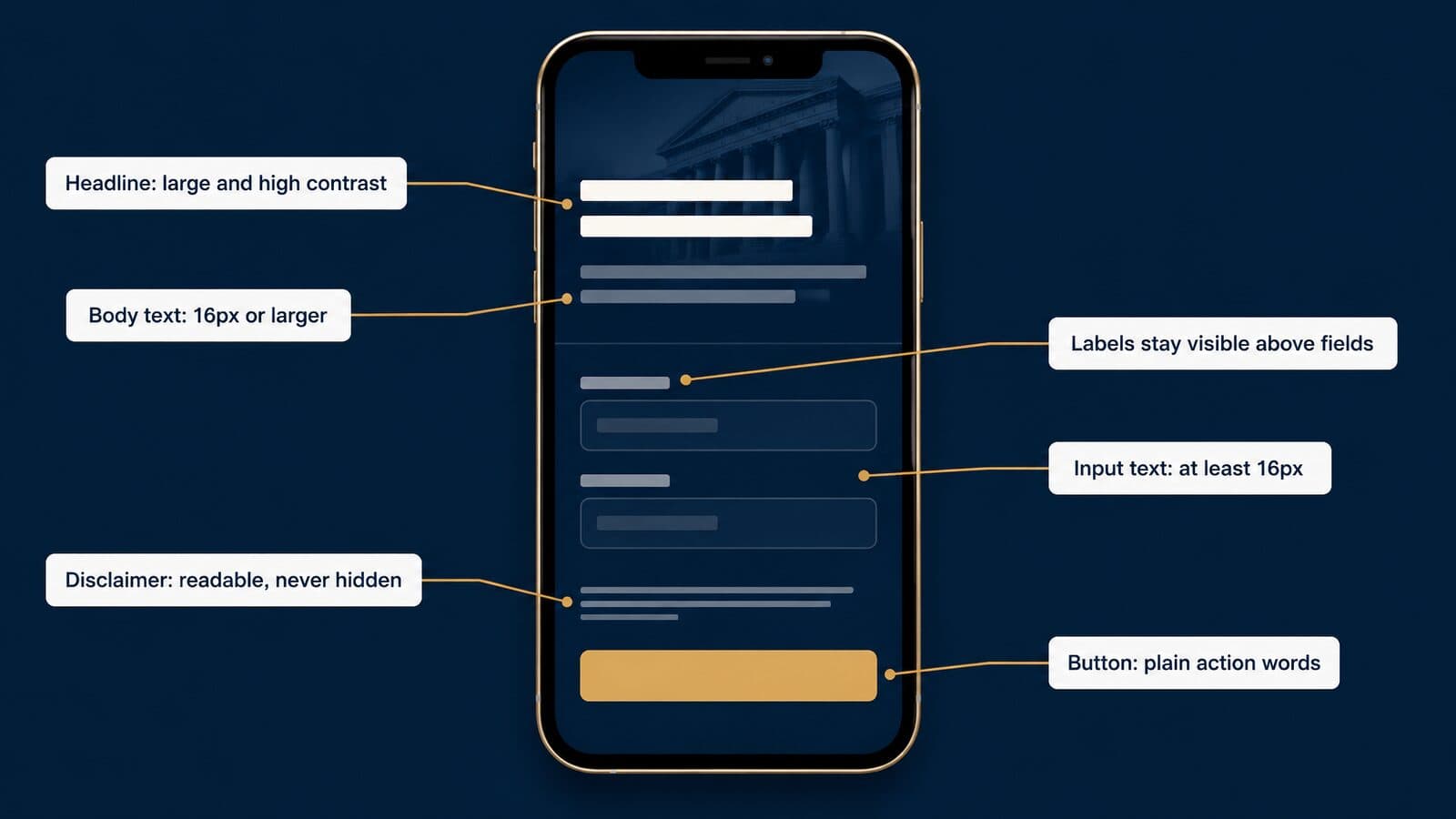
Button text should be a plain verb phrase that says what happens next, such as "Check your case" or "Call now," set large enough to read at arm's length and with at least 4.5:1 contrast against the button color. Avoid all-caps labels longer than two or three words.
The phone number deserves its own rule: it must be real, tappable text, never part of an image. A number inside a banner graphic cannot be tapped, cannot be read by a screen reader and fails WCAG's Images of Text criterion. For page structure beyond type, see PPC landing pages for law firms and the personal injury PPC guide.
Intake forms: labels, inputs and errors
Intake forms fail on small type more often than any other page element. Keep a visible label above every field. Placeholder text inside the box is not a label: it disappears as soon as the person starts typing, and it is usually low-contrast gray.
Set input text to at least 16px. On iPhones, inputs smaller than 16px commonly trigger an automatic zoom that throws the layout off and can leave the person scrolling sideways in the middle of the form.
Error messages should be written in text, next to the field, and not signaled by color alone. A red border with no words fails anyone who cannot distinguish red, and the message itself needs at least 4.5:1 contrast. Say what to fix in plain language: "Enter a 10-digit phone number" instead of "Invalid input."
Consent language, including the text that covers calls and texts, is often set tiny and gray at the bottom of the form. My recommendation is the opposite: keep it short, at a readable size, with enough line spacing to scan. For the operational side of intake, see mass tort intake services.
Social video captions and safe zones
Most social video is watched with the sound off, so burned-in captions carry the message. The common guidance is consistent across platforms: use a sturdy sans serif, set captions large with high contrast (white text on a dark band, or text with a solid outline), keep captions to one or two short lines, and keep every word inside the platform's safe zones so profile names, buttons and progress bars do not cover it.
Captions in legal ads have a second job. Any claim that appears in a caption is a claim in the ad, so review captions word for word against the approved script, the same way compliance reviews the voice-over. Auto-generated captions can mistranscribe drug names, product names and numbers.
Platform safe-zone dimensions change, so check them against current platform specs before each campaign. For detailed standards, see caption and safe-zone standards for Facebook video ads, and the service pages on Facebook advertising for mass tort firms and YouTube ads for law firms.
TV and CTV supers
On-screen supers on TV and connected TV are read from across a room, often on a screen the advertiser never sees. Heavy sans serifs with open shapes, a few words per super and strong contrast against the footage all help. Thin serifs and light weights tend to break up on compressed streams.
Disclosures carry the most risk. The FTC's Endorsement Guides at 16 CFR 255.0(f) define "clear and conspicuous" as difficult to miss and easily understandable by ordinary consumers. A visual disclosure should stand out by its size, contrast, location and the length of time it appears, and a disclosure made in both the visual and audible portions is more likely to qualify. That standard applies to endorsement and testimonial disclosures, but it is a useful benchmark for any super.
State bar rules may add their own requirements for attorney ads on TV, and they vary. This guide does not state any per-state size or duration; check each state's current rule. For production, see mass tort TV and CTV commercials and this roundup of the best personal injury lawyer commercials.
Attorney-advertising disclaimers
Attorney advertising is governed by state rules modeled on the ABA Model Rules. ABA Model Rule 7.1 bars a lawyer from making a false or misleading communication about the lawyer or the lawyer's services. Each state adopts its own version, and labeling and disclaimer requirements differ from state to state.
Those requirements also change. In New York, amendments to the advertising rules took effect June 1, 2026. According to the New York State Bar Association's summary, lawyers no longer have to put the words "attorney advertising" on everything, though communications must still name a lawyer or firm with contact information. Confirm the details against the court's order before relying on them.
The typography point is simple. A required disclaimer exists so that consumers notice and understand it. In my view, a disclaimer set in 8px gray text, or flashed on screen for an instant, works against that purpose and invites the question of whether the ad as a whole was misleading. Give disclaimers a size, contrast and placement that a reasonable viewer can read, and get the wording approved by whoever handles compliance.
For state-by-state detail, see the attorney advertising compliance page. This section is general information, not legal advice.
Email and email signatures
Email is the one channel where the firm controls the least. Many email clients do not reliably load web fonts, and there is no authoritative list of what each client supports. The safe approach is a font stack that names the brand font first and ends in web-safe fallbacks, such as Georgia or Arial, then a generic family. Design the email so it still looks right in the fallback.
Signatures should be live text: name, title, firm, phone and address as typed characters, not a single image. Image signatures are often blocked by default, cannot be tapped to call and are invisible to screen readers. Keep signatures to one family and two sizes, with the name slightly larger than the details.
Whichever fonts the system ends up with, each one has to be licensed for each of these channels: the website, the ads, the PDFs and the email.
Where to get law fonts legally: free, paid and custom
Get fonts from the foundry that made them, an authorized marketplace, Google Fonts or Adobe Fonts, and confirm the license covers every use you plan (desktop documents, your website, any app and PDF embedding) before anyone installs them.
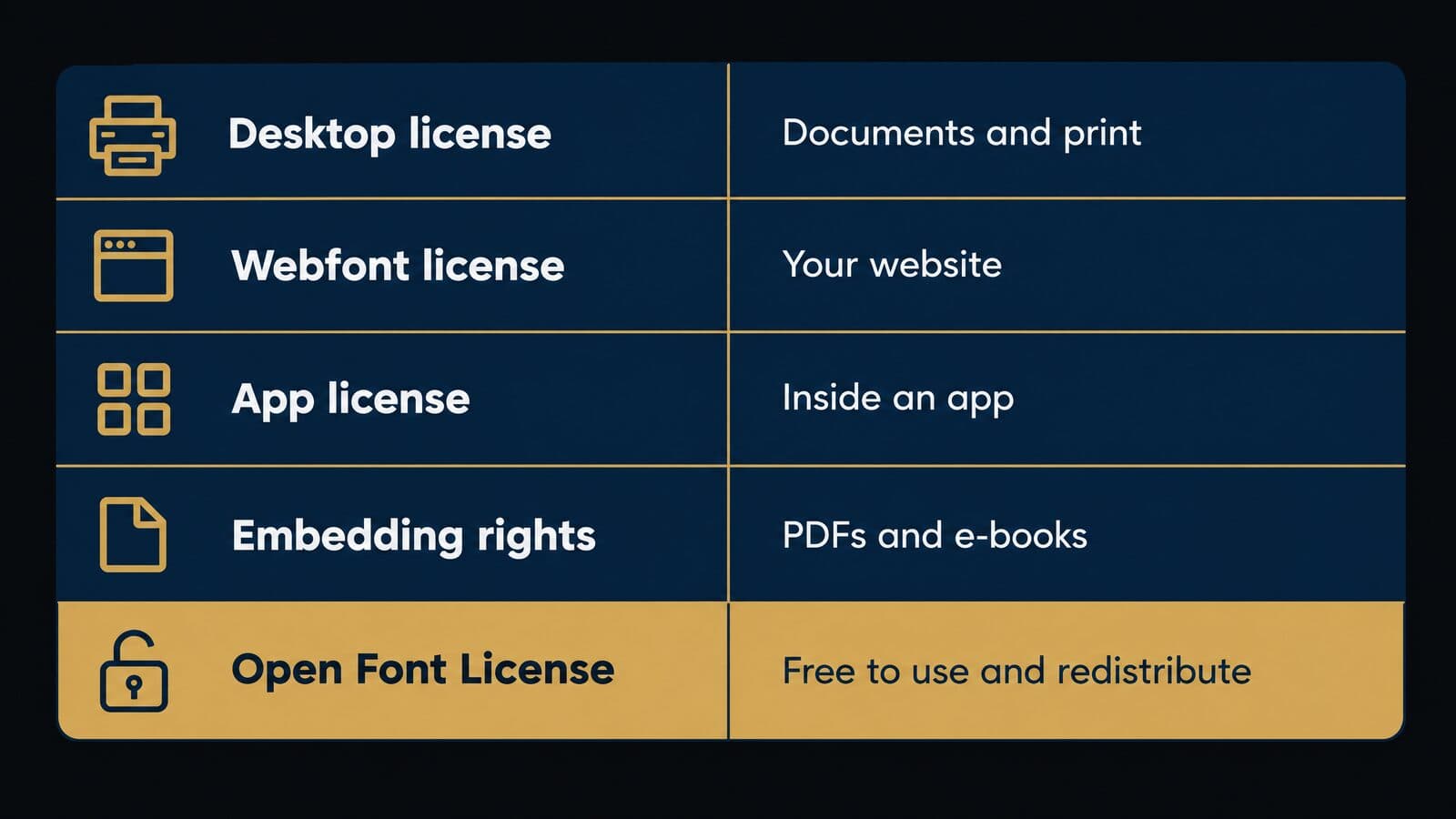
Free fonts with open licenses
The largest free source is Google Fonts, whose public metadata listed 1,950 font families when it was checked on October 22, 2026. Each family carries its own license. The google/fonts repository on GitHub sorts fonts into top-level folders by license and says every font there is licensed with permission to redistribute, subject to the license terms. In practice that means a firm can download the files and self-host them on its own server instead of calling Google's servers on every page view.
Many of the families law firms use most are under the SIL Open Font License (OFL), including Open Sans and EB Garamond. Open licenses like these let a firm use the same face in documents, on its website and in ads without buying separate rights, as long as it keeps the license file with the fonts.
Fonts bundled with Windows and Microsoft Office are a different case. They are licensed for use with those products, so typing a brief in Constantia or Book Antiqua is fine. Putting the same face on your website or inside an app is not covered. Microsoft's own Constantia page says its fonts can be licensed from Tiro Typeworks or Monotype for uses outside Microsoft products, including webfonts and app embedding. If you searched for "law fonts free", the honest answer is this: Google Fonts and other OFL families are free for nearly every firm use, and the Office fonts are free only inside Office.
Paid foundries and marketplaces
When a firm wants a commercial face, there are three main routes: a subscription, a marketplace or the foundry directly. Adobe Fonts advertises "Over 30,000 fonts" and says you can start "with more than 5,000 fonts for free." Adobe describes its fonts as licensed for personal and commercial use, with uses that include web projects, PDF embedding, and video and broadcast. Confirm current subscription terms with Adobe.
Two storefronts that older guides still recommend have closed as shops. Since March 28, 2024, fonts that were sold on Fonts.com and Linotype.com are sold through MyFonts or Monotype's subscription service, Monotype Fonts; both domains now show "new home" notices. MyFonts is a marketplace for many foundries. As of October 2026, it listed the Attorney typeface at $199.00 for the complete family, with single styles from $19.00, and the New Century Schoolbook LT complete family at $125.99.
Independent foundries sell direct. MB Type, the foundry of Typography for Lawyers author Matthew Butterick, sells eight families, including Equity, Concourse and Century Supra. Its buy-all page prices the full eight-family library at $499 for one or two people, rising to $3,999 for 81 to 100 people, and an Equity license for one or two people is $119. It is a one-time payment with a 30-day refund.
| Source | What you get | License model | Price note (Oct 2026) |
|---|---|---|---|
| Google Fonts | 1,950 families, many OFL | Per-family open license; self-hosting allowed | Free |
| Adobe Fonts | Over 30,000 fonts | Subscription; web, PDF, video uses listed | Over 5,000 free; rest by plan |
| MyFonts or Monotype Fonts | Many foundries in one store | Per-use licenses or Monotype subscription | Attorney family $199.00 |
| MB Type | Eight families, including Equity | One-time, priced by headcount | Equity from $119 |
| Independent foundries | Text and display families | Varies by foundry | Quoted per foundry |
Prices change often. Treat every figure above as a snapshot from October 2026 and confirm with the vendor before you buy.
How font licenses work
A font license is a list of permitted uses, and each use is usually a separate right. The desktop license lets people install the font and make documents. A webfont license lets your site serve the file to browsers. An app license covers bundling it in software. Embedding rights decide whether the font can travel inside a PDF, an e-book or a Word file someone else opens.
| License type | Covers | Typical limit | Check before buying |
|---|---|---|---|
| Desktop | Installing and making documents | Number of users or computers | Seat count matches staff |
| Webfont | Serving the font on a website | Sites, domains or pageviews | Which domains are covered |
| App | Bundling inside software | Number of apps or users | Client portals count |
| PDF and e-book embedding | Font travels inside the file | Read-only or editable copies | Court PDFs and shared drafts |
| Open license (OFL) | Use, embed and redistribute | Terms in the license file | Keep the license file |
The MB Type license is a useful example of how detailed these terms get. According to the MB Type license, read-only copies may be embedded in PDFs, e-books and apps; webfonts may be used on up to three websites the buyer owns; and read-write copies may go into word-processing files shared with fewer than 20 people. It also carves out documents a law office makes for clients, such as letters and court filings, from the limit on who may use the fonts. Other foundries draw these lines differently.
Embedding in Word has its own layer. Microsoft explains that a font maker can mark a font as Non-embeddable, Preview/Print, Editable or Installable, and Microsoft's embedding guide notes that Office cloud fonts download automatically, so they rarely need embedding.
Keep every license file and receipt with the brand style guide, and count seats honestly against actual staff.
Free law-font download sites and piracy risk
Search for "law fonts" and you will find download sites with category pages of decorative "law" or "legal" fonts, with licenses that range from personal-use-only to unclear. Some of the same sites also host copies of commercial fonts that their makers never released for free. Downloading one of those does not give the firm a license, however official the page looks.
The rule is simple: download only from the foundry, an authorized marketplace such as MyFonts, Google Fonts or Adobe Fonts. Open the license file before the font goes anywhere near a template, and if there is no license file, do not use the font.
Before rolling out new templates, check what is already installed on firm machines. A partner's laptop may hold a font an earlier designer installed without a license, and every document built on that machine inherits the problem.
Commissioning a custom typeface
A custom typeface is a font drawn for one client, and the cost is quoted case by case. No foundry publishes standard pricing. The price depends on the character set, the number of weights and italics, the scripts needed, whether the firm wants exclusivity, and how broad the license must be across desktop, web, app and broadcast use.
In my view, a full custom family makes sense only for large multi-office brands that will use it across years of print, web and TV work. For most firms, a cheaper alternative gives most of the distinctiveness: license a good commercial or open family for text, and have a designer customize only the wordmark in the logo. The Attorney typeface is a reminder of the path: its designer first developed it as a custom font for a law firm.
Law firm typography audit checklist
Audit your firm's fonts in five areas (court documents, templates and PDFs, the website, ads and intake, and print and email) once a year, and again whenever a court amends its rules or Microsoft changes the Office default.
Court filings and documents
- Record the font, size and length rule for each court you file in, with the date you last checked it.
- Confirm certificates of compliance state the word count, and the font where a rule requires it, as Florida's does.
- Check footnote sizes against each court's rule, not the template default.
- Use italics for case names and emphasis, not underlining.
- Remove condensed, display and script faces from every filing template.
Templates and PDFs
- Keep one Normal template per document type: briefs, letters, contracts and memos.
- Set the default font in each template using Word's Set As Default steps covered earlier.
- Turn on font embedding at save (File > Options > Save) for any shared commercial font.
- Produce PDFs that are text-searchable, and PDF/A where a court asks for it.
- Note a metric-compatible fallback, such as Tinos or Arimo, for each document font.
Website and landing pages
- Limit the site to one or two families, self-hosted rather than called from a third party.
- Set body text at 16px or larger.
- Check text contrast reaches at least 4.5:1 against its background.
- Zoom to 200% and confirm nothing is cut off or overlaps.
- Apply a text-spacing test and remove any text baked into images.
- Confirm Cumulative Layout Shift stays at 0.1 or less after the font loads.
Ads, video and intake
- Burn in captions that match the audio word for word and stay legible on a phone.
- Get disclaimers approved and check they are readable on the smallest placement you buy.
- Set form input text to at least 16px.
- Keep form labels visible above fields, not as placeholder text that disappears.
- Show phone numbers as live text, never inside an image, across your social media ad campaigns for law firms and landing pages.
Print, signage and email
- Print letterhead, business cards and envelopes from the same family as the documents.
- Give email templates a font stack with safe system fallbacks.
- Set email signatures as text, not a single image.
- Check office and courthouse-facing signage uses the brand face at readable sizes.
Rolling out the changes
Do the work in order of risk. Fix document templates first, because a court filing that breaks a rule costs more than a dated web font. Update the website next, then rebuild ad and video templates so new creative inherits the corrected type. Assign sign-off before anything ships: a partner approves document templates, and whoever reviews attorney advertising for compliance approves ad, video and disclaimer templates. If you want a second pair of eyes on your landing pages, intake forms or ad creative, book a strategy call with Mass Tort Marketing Agency.
Sources and methodology
This guide was researched from primary sources, from the review of search results through a fact check completed on October 22, 2026, and rules, prices and figures are linked to their sources where they are first used. Where a primary source could not be read, the article says so and names the secondary source used.
How this guide was researched
The research began with the Google results for six variants of the topic on October 22, 2026: law fonts, lawyer font, lawyer fonts, font for lawyers, fonts for lawyers and attorney font.
Court rules were read on the courts' own websites: the Supreme Court, uscourts.gov for the federal appellate rules, the Seventh and D.C. Circuits, and the California courts. Where a court site blocked automated access, the guide relied on the bar's own publication or a rules mirror and labels it in the text; that applies to Florida, North Carolina and Washington. Typeface histories come from Microsoft's typography pages, Google Fonts metadata and vendor pages. Prices were captured on October 22, 2026. Lawyer-website font data comes from ILOVEWP's crawl dated November 23, 2024. The one first-hand example is this site's own source code.
No reader testing, surveys or A/B tests were run for this guide, and it makes no claims that any font improves conversion rates or builds trust.
Primary sources consulted
- Rules of the Supreme Court of the United States, 2026, accessed October 22, 2026
- Federal Rules of Appellate Procedure, as amended to Dec. 1, 2024, accessed October 22, 2026
- Seventh Circuit guidance on typography in briefs, accessed October 22, 2026
- AsymaDesign, LLC v. CBL & Associates Management (7th Cir. 2024), accessed October 22, 2026
- D.C. Circuit notice, Preferred Typefaces for Briefs, accessed October 22, 2026
- The Florida Bar News on Florida's appellate font rule, accessed October 22, 2026
- California Rules of Court, rule 8.204, accessed October 22, 2026
- WCAG 2.2, accessed October 22, 2026
- U.S. Web Design System typography guidance, accessed October 22, 2026
- CSS Values and Units Module Level 4 and CSS Fonts Module Level 4, accessed October 22, 2026
- NIST SP 811, Appendix B.8, accessed October 22, 2026
- DOJ guidance on web accessibility and the ADA, accessed October 22, 2026
- Federal Register, Title II compliance date extension, accessed October 22, 2026
- CDC vision loss facts, accessed October 22, 2026
- Microsoft typography font pages, Google Fonts metadata and MB Type, accessed October 22, 2026
- ILOVEWP, Most Used Google Fonts on Lawyer Websites, accessed October 22, 2026
Limits and update schedule
Some gaps are deliberate. Texas and Virginia rules were not verified on a primary source, so the guide points readers to those courts' current rules instead of stating sizes or font lists. The Washington and North Carolina rules come from bar publications, not the court sites. Vendor prices change often and are snapshots from October 2026.
The page is reviewed quarterly, and sooner whenever the Supreme Court, the federal appellate rules or a listed state amends its formatting rules. The next scheduled review is January 2027. Corrections are welcome through the site's contact page. Nothing here is legal advice; confirm the current rule with the court before you file.